A Restaurant Logo That Earns Its Place on the Menu
Create a professional restaurant logo in 2 minutes — ready for your menus, signage, delivery apps, and grand opening. No design skills needed.
What Is a Restaurant Logo Maker?
A restaurant logo maker is a tool that generates a custom logo for your food business without hiring a designer — you describe your cuisine, atmosphere, and style, and it produces a finished icon and wordmark you can put on a menu, storefront sign, or delivery app the same day. GoodLogoAI's restaurant logo maker uses AI trained on food-and-beverage branding: it understands that a ramen shop's palette shouldn't look like a steakhouse's, and that a logo has to stay legible printed tiny on a to-go cup as much as it does on an illuminated sign. That's the difference between a generic logo generator and one built specifically for restaurants.
2 min
Average creation time
$9.99
One-time, no subscription
SVG
Infinite-scale vector file
30-day
Money-back guarantee
✦ Restaurant logos created with GoodLogoAI
Logos like these take under 2 minutes to create with GoodLogoAI. No design skills needed.
Free to try · $9.99 to download SVG + PNG
Why a Restaurant Logo Is Different From Any Other Logo
A restaurant logo doesn't just represent a business — it has to make people hungry, signal what you serve, and compete on a delivery app thumbnail, all at once.
It Has to Make People Hungry
A tech company's logo needs to look trustworthy. A restaurant logo needs to trigger appetite. That means warm colors, inviting shapes, and a feeling that this place serves good food — communicated before a customer reads a single word.
Delivery Apps Changed the Stakes
On Uber Eats or DoorDash, your logo is a 100px thumbnail competing with hundreds of others. A restaurant logo that only looks good at full size is invisible to the majority of modern diners who order from their phones.
It Goes Everywhere at Once
Your logo appears on menus, storefront signage, packaging, napkins, social media, business cards, uniforms, and vehicles — in color, in black, on dark and light backgrounds. No other business type demands this many contexts simultaneously.
Professional Without Spending Like a Chain
Opening a restaurant is expensive. Spending $5,000 on a logo before you've served your first customer is a misallocation of money that should go toward food quality and marketing. There's a middle ground: professional branding at a price that makes sense before you have revenue to back it.
What Style Fits Your Restaurant?
From rustic BBQ joints to minimalist sushi bars — every style of restaurant has a logo language. Find yours below.
Vintage & Retro
Diners, BBQ, traditional Italian
Modern Minimal
Contemporary cafes, fusion, upscale casual
Rustic & Artisan
Farm-to-table, craft bakeries, local spots
Elegant Upscale
Fine dining, steakhouses, occasion dining
Playful & Casual
Family spots, ice cream, taco trucks
Ethnic & Authentic
Heritage cuisine, traditional recipes
Bold Fast Casual
Delivery-focused, fast-casual chains
Organic & Healthy
Vegan, juice bars, health-focused spots
Not sure which fits? Describe your restaurant to the AI — it will suggest the right style automatically.
What Makes a Great Restaurant Logo?
After looking at hundreds of successful restaurant logos — from neighborhood favorites to global chains — the same patterns show up every time.
Makes you hungry
The logo's job is appetite appeal — warm colors, inviting shapes, food associations.
Signals cuisine instantly
Italian, sushi, BBQ, vegan — identifiable in three seconds without reading a word.
Readable at 100px
Legible as a delivery app thumbnail, social profile, and business card icon.
Avoids generic clipart
No fork-and-knife sets, no chef hats, no stock plate illustrations.
Works in black and white
Menus, receipts, business cards — your logo will be printed in grayscale.
Three format versions
Full color, all-black, all-white. Covers 99% of deployment contexts.
Matches the price point
Fine dining logos look different from fast casual — and should.
Timeless, not trendy
Glassmorphism looks dated in 24 months. A clean classic lasts 10+ years.
8 Design Principles Every Restaurant Logo Needs
These aren't generic design tips. They're patterns extracted from restaurant logos that have stood up to menus, delivery apps, signage, and a decade of use.
Appetite Appeal — Does It Make People Hungry?
Your restaurant logo has one job no startup or SaaS logo has: it needs to make people want to eat. Warm colors (red, orange, earthy tones) have strong associations with food, warmth, and comfort. Rounded shapes feel more approachable and edible than sharp angles. Ask five people: 'Does this make you want to eat here?' That question should guide every design decision.
Practical test: Test it against your own hunger response. If it reminds you of a hospital or a tech company, start over.
Cuisine-Appropriate Style
Italian restaurants, sushi bars, BBQ joints, and vegan cafes all need different logos. Your style should signal cuisine type and price point in the first three seconds — before a customer reads a single word. Fine dining calls for elegant serifs and restraint. Fast casual needs bold type and energy. Mismatching confuses customers about what to expect when they arrive.
Practical test: Search '[your cuisine] restaurant logos' on Google Images. Note what the category looks like. Then decide: fit in, or stand out deliberately.
Readable at Every Size — From App to Awning
Your logo lives in wildly different contexts: a 100px thumbnail on Uber Eats competing with hundreds of other restaurants, a menu cover at reading distance, and a 4-foot sign visible from the street. Details that look refined at full size become unreadable mud at small sizes. Thin lines disappear. Delicate script becomes a blur. Design for the smallest context first.
Practical test: Shrink your logo to 100×100 pixels and hold it at arm's length. If it's unreadable, simplify until it pops.
Memorable Enough to Describe Out Loud
When someone recommends your restaurant to a friend, they might describe your logo without thinking: 'the one with the green tree,' 'the red circle with the fork.' That mental shortcut is worth everything. Logos that are too abstract or too generic get described as 'the one that looks like every other restaurant.' A distinctive element — an unexpected color, a specific icon, a clever name treatment — is how logos become landmarks.
Practical test: Ask someone to describe your logo to a friend over the phone. What they say reveals whether it's memorable — and what they actually remember.
Color Psychology for Food
Color choice isn't aesthetic in restaurants — it's strategic. Red is associated with energy, appetite, and urgency: McDonald's, KFC, and Pizza Hut use it deliberately. Green signals fresh, healthy, and natural: Sweetgreen, Panera, and Shake Shack use it to communicate their positioning. Black reads as premium. Orange and earthy tones feel warm and approachable. Blue is the one color almost no successful restaurant brand uses as a primary — and for good reason.
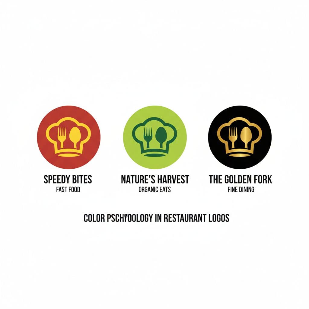
Practical test: Look at your top five competitors' logo colors. Either match them (signals you belong in the same category) or go opposite (signals you're different). Both work if intentional.
Works Across Every Touchpoint
Your logo appears on your storefront, menu, packaging, business cards, social media, delivery app profile, uniforms, and vehicle wraps — in color, black, white, on light and dark backgrounds. A logo that only works in one format is a logo that fails half the time. You need at minimum: a full-color version, an all-black version, and an all-white version.
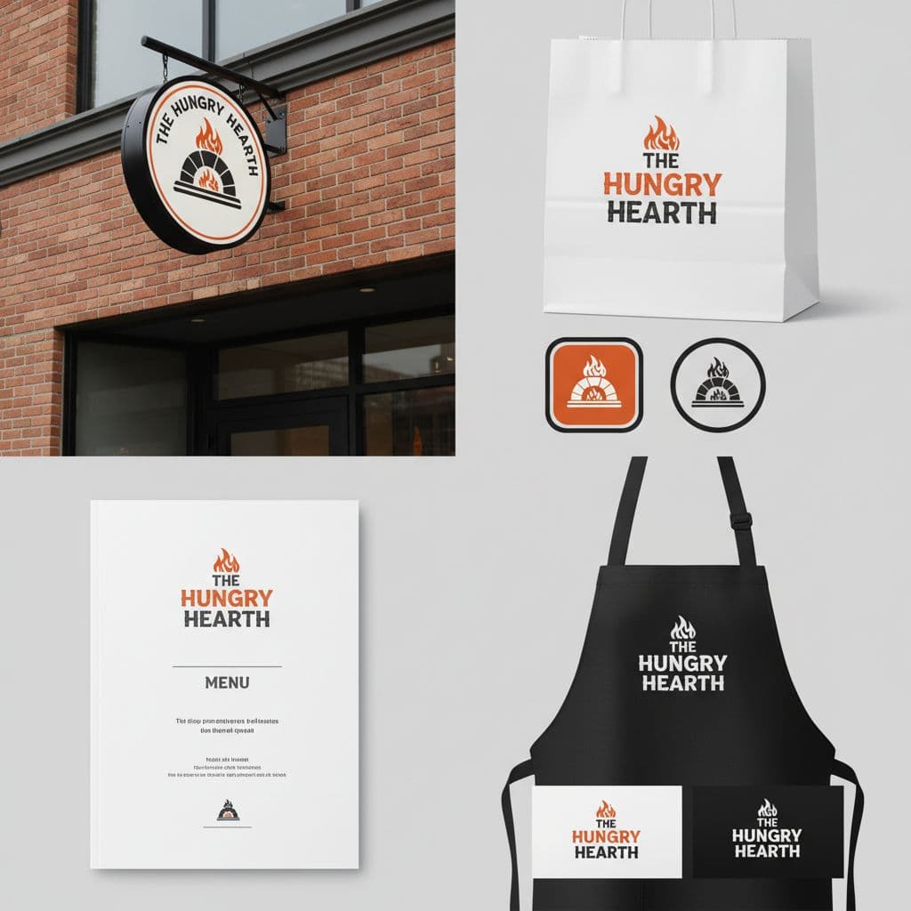
Practical test: Test your logo on a white background, a black background, and printed in grayscale. If it looks broken on any of these, it needs adjusting.
Avoid the Restaurant Clichés
Fork-and-knife clipart. Chef's hats. Generic plates. Script text that just says 'Kitchen' or 'Bistro.' These are the restaurant logo equivalents of stock photography — technically fine, deeply forgettable. Customers walk past 50 restaurants on a busy street. Generic logos all blur together. Something specific to your story — your name, your concept, an unexpected visual — is what gets remembered.
Practical test: Google 'restaurant logo' and screenshot the first 20 results. Anything that appears three or more times is a cliché to avoid.
Scalable for Growth
You're opening one location. But what if it works? A second location, a catering arm, a food truck, a franchise. Your logo needs to work for one restaurant or a hundred. Hyper-local references, trendy effects, and overly complex designs are expensive to replicate and quick to date. The restaurants with logos that outlasted their opening year all chose restraint over novelty.
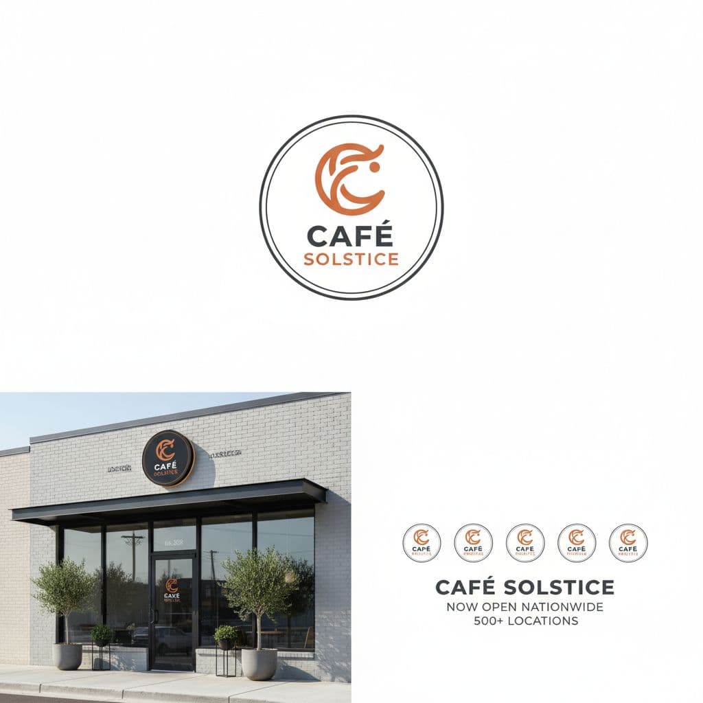
Practical test: Ask yourself: 'Would this logo still make sense on 10 locations in 5 years?' If not, simplify and broaden its appeal.
Color Psychology for Restaurant Logos
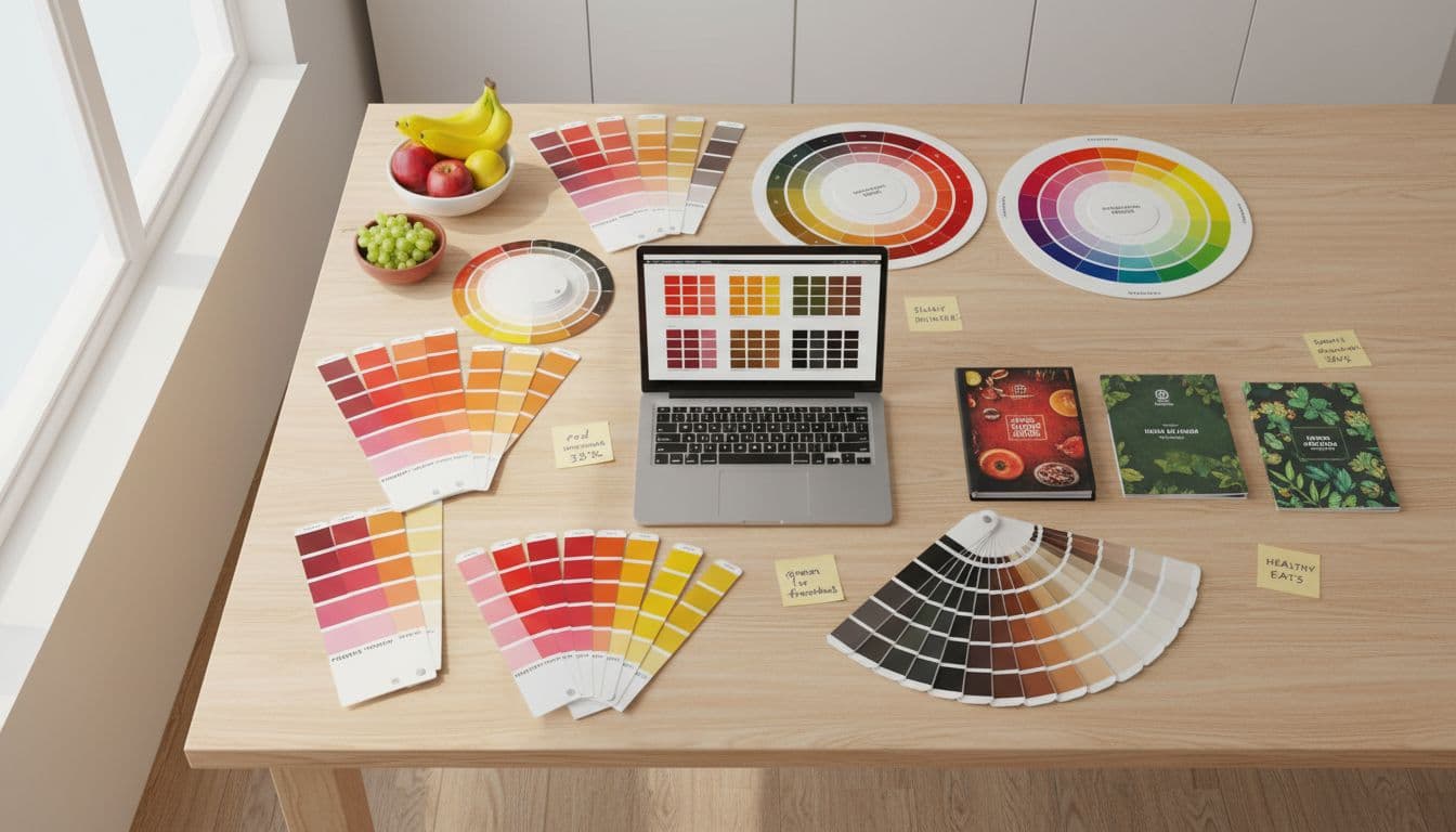
Color choice signals cuisine, price point, and brand personality before a customer reads a word. Here's what each major choice communicates — and which restaurants use each effectively.
Red
Appetite · Urgency · Energy
Examples: McDonald's, KFC, Pizza Hut, Wendy's, Chick-fil-A
Best for: Fast food, pizza, casual dining, high-volume concepts
Red is associated with energy, warmth, and appetite. It's the most common primary color in restaurant branding — not by accident.
Green
Fresh · Healthy · Natural
Examples: Sweetgreen, Panera Bread, Shake Shack, Chipotle (secondary)
Best for: Health-forward, organic, farm-to-table, vegan, juice bars
Green signals fresh ingredients and health-conscious positioning. Effective for differentiating in a sea of red-and-yellow fast casual.
Black
Premium · Sophisticated · Refined
Examples: Nobu, Capital Grille, Morton's, Shake Shack (primary)
Best for: Fine dining, steakhouses, premium casual, upscale date-night
Black communicates quality and exclusivity. Customers associate dark branding with higher prices and better ingredients — use it if that's your positioning.
Orange & Warm Earth
Approachable · Warm · Value
Examples: Chipotle, Dunkin', Jamba Juice, Little Caesars
Best for: Casual restaurants, family-friendly, approachable concepts, Mexican food
Orange and warm earth tones suggest warmth, comfort, and accessibility. They work especially well for casual concepts where you want energy without aggression.
What the Best Restaurant Logos Have in Common
Not case studies — lessons. What each iconic restaurant logo got right that you can apply today.
McDonald's
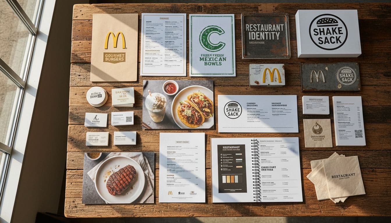
Fast FoodThe golden arches don't show a burger. They're an architectural element turned into a brand mark — simple enough that a five-year-old draws it correctly. Red triggers appetite and urgency; yellow suggests happiness and affordability. The color combination is more powerful than any food illustration could be.
What to steal: The best restaurant logos communicate feeling, not just food. Red + yellow became shorthand for fast, fun, and affordable.
Starbucks
Coffee ShopThe siren icon has been simplified three times since 1971 — each iteration removing detail to make it bolder and more recognizable. Green was a counterintuitive choice in a category dominated by brown coffee tones, which is exactly why it worked. Now green means coffee to millions of people.
What to steal: Own an unexpected color in your category. Starbucks didn't look like other coffee shops — that was the point.
Chipotle
Fast CasualThe hand-drawn quality of the Chipotle wordmark does something clever: it signals 'made from scratch' without saying it. At a time when fast food meant slick and corporate, rough-edged typography communicated real ingredients and real cooking. The logo made a promise the food had to keep.
What to steal: Style is a statement about values. Chipotle's rough lettering said 'we're not like other fast food' before anyone read the menu.
Shake Shack
Premium CasualBlack and white in fast casual is almost unheard of. Everyone else uses primary colors. Shake Shack used monochrome to justify a $15 burger in a world of $5 value meals — the design says 'premium' before you read the price. The circular badge format borrows from craft beer and artisan food, signaling quality.
What to steal: Color (or lack of it) sets price expectations. Black and white in fast casual meant premium — a design choice worth millions.
In-N-Out Burger
Regional Fast FoodBold red and yellow with vintage arrow lettering — designed to be visible at 70mph from a California highway. The old-fashioned styling creates nostalgia and signals authentic recipes that haven't changed since 1948. The palm tree anchors it geographically. It's regional pride as logo design.
What to steal: If you serve loyal regulars, lean into your story. In-N-Out's vintage look says tradition — and tradition in food means trust.
Sweetgreen
Healthy Fast CasualEntering a space dominated by beige and red, Sweetgreen used clean green and white to visually separate themselves from every other fast casual option. The minimal wordmark suggests modernity and confidence — nothing needs decorating when the food quality speaks for itself. It's a logo that looks expensive without costing like fine dining.
What to steal: Deliberate differentiation in a crowded category is a strategy, not just aesthetics. Sweetgreen looked like nothing else in fast casual — and that was the whole point.
How Our Restaurant Logo Maker Works — 4 Steps
No design experience needed. Describe your restaurant — the AI handles the rest.
Describe Your Restaurant
Tell the AI what cuisine you serve, your atmosphere (fast casual, fine dining, family-friendly), and the vibe you want. The more specific you are, the better. 'Rustic Italian trattoria, warm and traditional, southern Italian focus' beats 'Italian restaurant logo.'
- Name your cuisine type and price point
- Describe the atmosphere (rustic, modern, upscale, casual)
- Mention your target customer if it helps: families, date nights, business lunch
AI Generates Restaurant-Optimized Designs
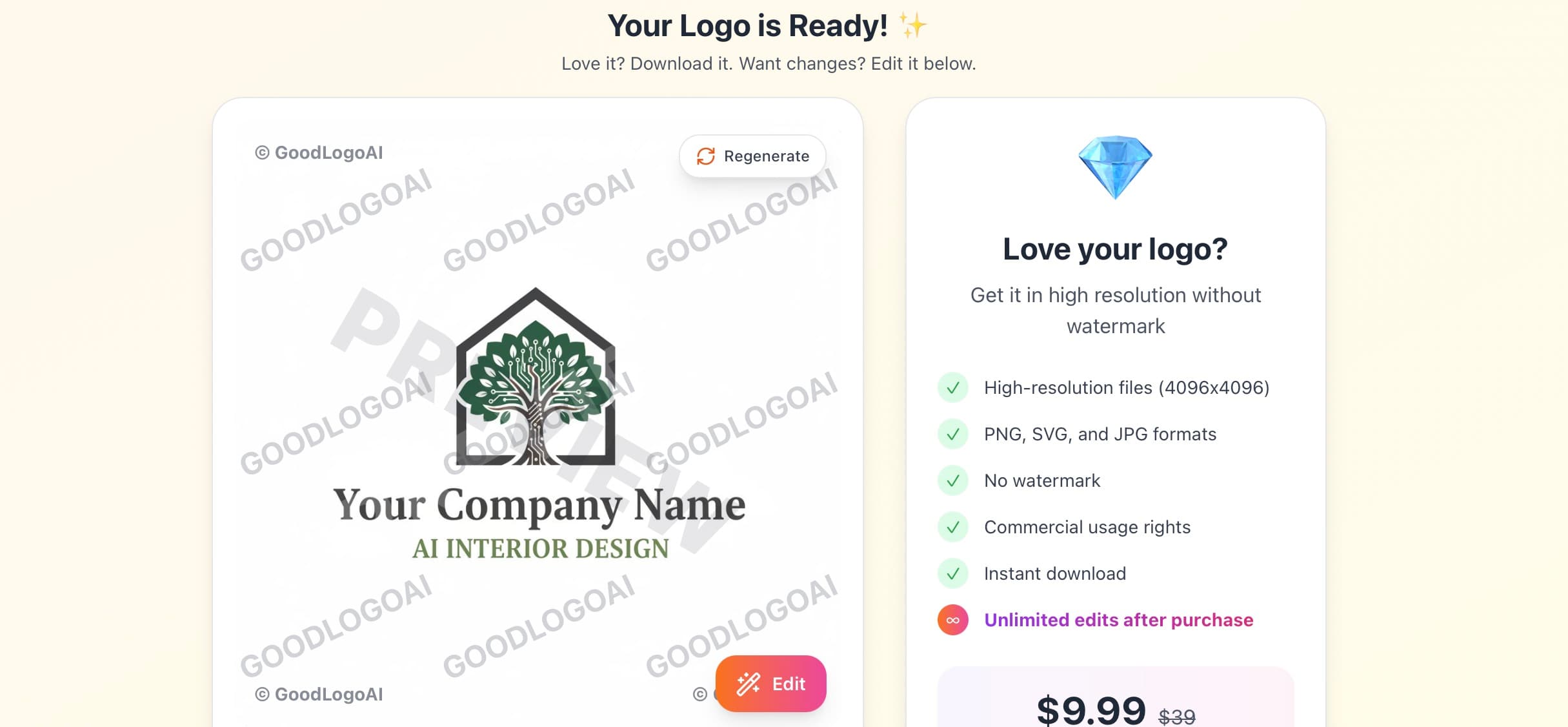
The AI applies restaurant-specific design thinking automatically — appetite-appropriate colors, cuisine-matching typography, and layouts that work at thumbnail size. It understands that a sushi bar logo should feel different from a BBQ joint.
- Appetite-appropriate color palette selected for your cuisine type
- Typography matched to your concept and price point
- Multiple style variations generated for comparison
Refine With Plain-English Feedback
Not quite right? Tell the AI what to change. 'More rustic, like a BBQ joint,' 'cleaner and more upscale,' 'try without an icon, just the name.' The AI understands restaurant brand language and adjusts until it's right.
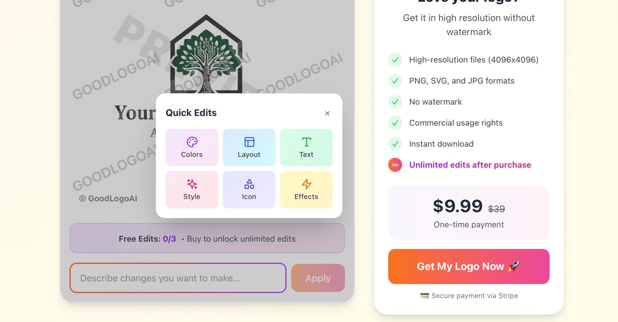
- Try 3 versions free — no card needed
- Reference specific restaurants for direction: "like Chipotle but darker"
- Test how it reads at small delivery-app thumbnail size before finalizing
Download Everything You Need
One $9.99 payment gets you SVG (for printing at any size — signage, menus, wraps), high-res PNG with transparent background, JPG, plus white and black variants. Everything your restaurant needs from opening day forward.
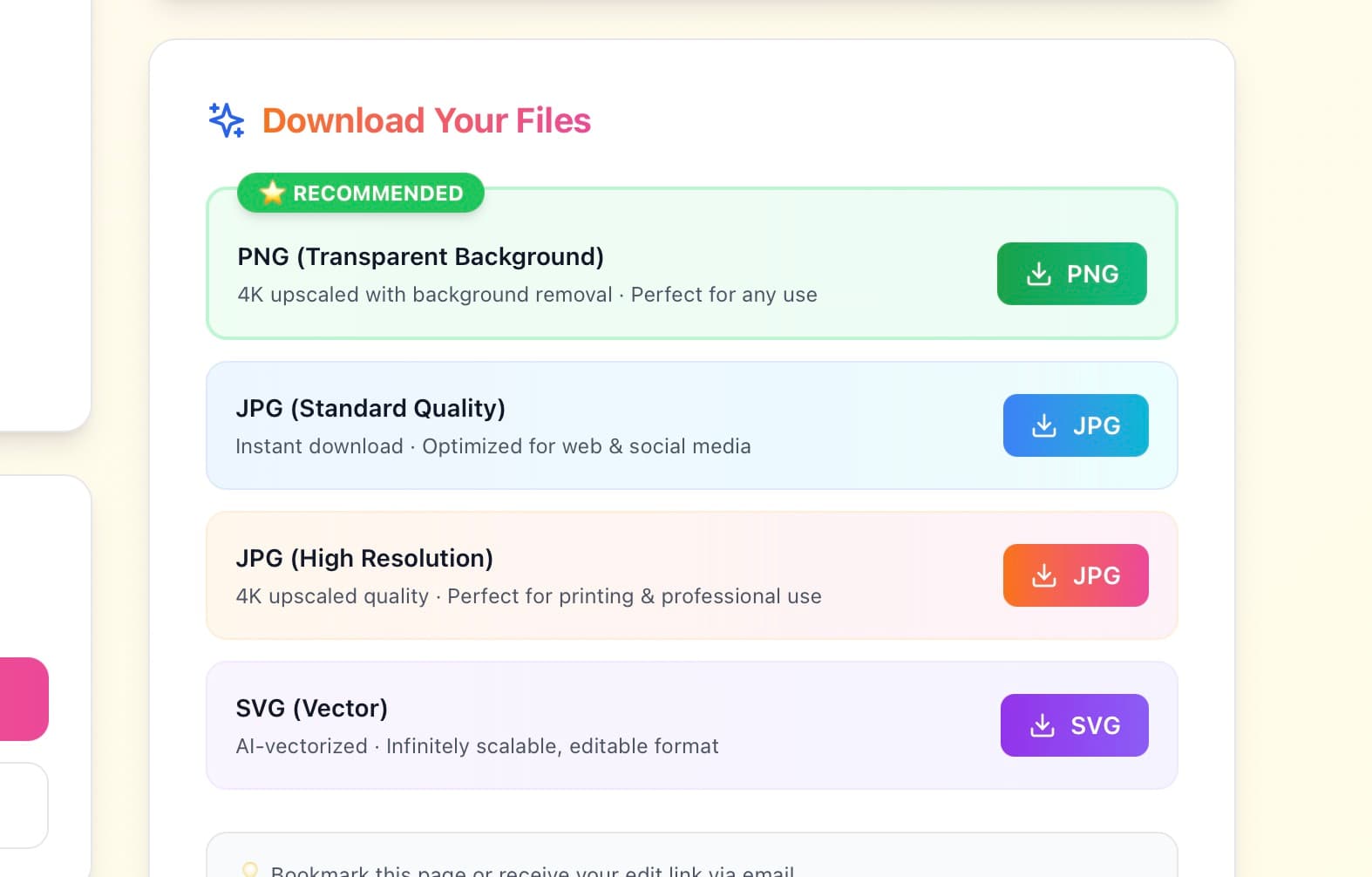
- SVG for signage, menus, and vehicle wraps at any size
- Transparent PNG for overlaying on any background
- White variant for dark napkins, packaging, and window clings
Try free · $9.99 to download · 30-day guarantee
Restaurant Logo Do's and Don'ts
Do These
✅ Test at delivery app thumbnail size
Shrink to 100px and check: is it still recognizable? If not, simplify until it is.
✅ Match cuisine and price point
Fine dining looks different from fast casual — and should. Mismatches confuse customers before they walk in.
✅ Get icon AND name in your primary logo
Until you're a household name, always include your restaurant name. Icon-only is for established brands.
✅ Use warm colors for appetite appeal
Red, orange, earthy tones — warm colors have strong associations with food, warmth, and comfort.
✅ Create multiple format versions
Full color, all-black, all-white, icon-only. Menus, signage, and packaging all need different versions.
✅ Start affordable, upgrade when profitable
Don't spend $5K on a logo before you've served your first table. Validate the business first.
Avoid These
❌ Don't use generic clipart
Fork-and-knife sets, chef hats, generic plates — customers have seen these on every restaurant. It signals "no personality."
❌ Don't use blue as a primary color
Blue is the one color almost no successful restaurant brand uses primarily — it has weak associations with food.
❌ Don't design for your personal taste
Design for your customer's expectations. If you run a family pizza place, "minimal and monochrome" may not be right for your guests.
❌ Don't overspend before opening
Spending thousands on branding before you've validated your concept puts money in the wrong place. Start lean.
❌ Don't use trendy design effects
Glassmorphism, 3D gradients, neobrutalism — all look dated quickly. A clean classic outlasts every trend.
❌ Don't launch with only one logo version
You'll need your logo on dark backgrounds, in print, as a small icon. Design for all contexts from day one.
What Restaurant Owners Say
"Opening my Italian bistro was stressful enough without spending $5K on branding. Got a logo I'm proud of in 10 minutes. Customers say it makes them feel like they're in Italy before they even sit down."
Maria G.
Italian Restaurant Owner
"As a food truck, I needed something that looked great on Instagram and on the truck wrap. One logo did both. People recognize the truck from blocks away now."
James P.
Food Truck Owner
"I've opened 3 restaurants. Spent a lot on branding for the first two. Used GoodLogoAI for my third and honestly? Customers love it just as much. Wish I'd known about this sooner."
Antoine R.
Multi-location Restaurant Owner
Restaurant Logo Design — Frequently Asked Questions
What colors work best for a restaurant logo?
Warm colors — red, orange, yellow, and earthy tones — have the strongest track record in restaurant branding. Red is associated with energy and appetite (McDonald's, KFC, and Pizza Hut use it deliberately). Orange is warm and approachable. Green works for health-forward concepts like Sweetgreen and Panera. Black reads as premium and is common in fine dining. The one color to be careful with: blue. It's associated with suppressed appetite — which is why almost no successful restaurant brand uses it as a primary color.
Should a restaurant logo include food imagery?
Not necessarily. McDonald's arches don't show a burger. Starbucks' siren isn't coffee. What matters is appetite appeal and memorability, not literal food depiction. Simple food icons (a pizza slice, a bowl, a leaf) can work when executed with restraint and originality. What doesn't work: generic clipart of forks, chef hats, or plates that every other restaurant already uses. If you use food imagery, make it specific to your concept.
How do I make my restaurant logo stand out on delivery apps?
Delivery apps are competitive at small sizes. Your thumbnail competes with hundreds of others at roughly 100×100 pixels. The logos that win are bold, high-contrast, and instantly readable at tiny sizes. Complex illustrations and delicate script fonts become indistinguishable at thumbnail size. Shrink your logo to 100px wide and hold it at arm's length — if you can't tell what it says or what it is, simplify. A single bold icon or short name in thick lettering outperforms intricate designs every time.
What's the difference between fine dining and casual restaurant logos?
Fine dining logos lean into restraint: elegant serif fonts, black or gold color palettes, generous white space, and nothing that feels playful or energetic. The logo communicates 'this meal is an occasion.' Casual restaurants do the opposite — bright colors, bold type, rounded shapes, and an energy that says 'fun and food go together.' The biggest mistake is mismatching: a casual logo on an upscale restaurant confuses guests about what to expect before they walk in.
Do I need different logo versions for my restaurant?
Yes. The minimum set most restaurants need: a full-color version with icon and name (your primary logo), a square icon-only version for delivery apps and social profiles, a black version for print menus and business cards, and a white version for dark signage, windows, and packaging. GoodLogoAI provides all of these in one download. Launching with only one version means scrambling every time you need to apply your brand somewhere new.
Should I use my restaurant name or just an icon?
Until your restaurant is well-established, always include your name. Customers encountering you for the first time — on Google Maps, a delivery app, a flyer — need to know what you're called. Icon-only logos work for brands with years of recognition. Use icon + name together for your primary logo, then use the icon alone only in contexts where the name is already visible nearby.
How do I choose between a modern and vintage style?
Match your restaurant's real story. Vintage and rustic styles work when your honest narrative is tradition, family recipes, or authenticity — they signal 'we've been doing this a long time.' Modern and minimal styles work for contemporary concepts and innovative cuisines. The mistake is picking a style because it looks cool right now rather than because it reflects what your restaurant actually is. Diners notice the disconnect.
What file formats does a restaurant need for its logo?
The essential three: SVG (infinitely scalable vector, for signage, menus, and your developer or printer), high-resolution PNG with transparent background (for overlaying on any material), and JPG (for documents and presentations). Beyond that: a 512×512px PNG for delivery app icons and a white single-color version for dark backgrounds. GoodLogoAI provides SVG, PNG, and JPG in one download.
Can I trademark an AI-generated restaurant logo?
Yes — trademark eligibility depends on distinctiveness, not on how the logo was made. As long as your logo is distinctive and doesn't conflict with existing registered marks, you can trademark it. With GoodLogoAI's paid download, you receive full commercial rights, which is the prerequisite for filing. Before filing, run a search on USPTO.gov to check for conflicts with existing marks.
How much should a new restaurant spend on a logo?
Pre-opening, when cash is tight: $10–$100 with an AI logo maker like GoodLogoAI. Once open and profitable: $500–$2,000 for a freelance designer who can build a cohesive brand system. For established restaurant groups or franchises: $5,000–$20,000 for agency work. The critical mistake is spending $5,000 on branding before opening when you don't yet know if your concept resonates. Get something professional and affordable, validate the business, then invest in deeper brand work.
Written by the GoodLogoAI Team • Updated July 2026
Guidance drawn from designing thousands of restaurant, cafe, and food-truck logos across every cuisine.
Your Restaurant Logo Is 2 Minutes Away
Get a professional restaurant logo before your grand opening — without spending like a chain. Free to try, $9.99 to download SVG + PNG + JPG.
No signup • SVG + PNG + JPG • 30-day guarantee