Logo for SaaS That Works Everywhere
The AI SaaS logo generator built for the real demands of software companies — scalable from 16px to billboard, dark-mode ready, and designed to earn B2B trust. Create yours free in minutes.
What Is a SaaS Logo?
A SaaS logo is the visual identity for a software-as-a-service company — the icon and wordmark that represent your product across your app, website, app stores, and marketing. Unlike a logo for a retail shop or restaurant, a SaaS logo is judged almost entirely on screens: it has to hold up as a 16px browser favicon, sit cleanly in a dark-mode sidebar, and still read as trustworthy to a B2B buyer scrolling past it in a crowded comparison page. That's a narrower, harder brief than most logo design covers — which is why generic logo makers often fall short for software companies.
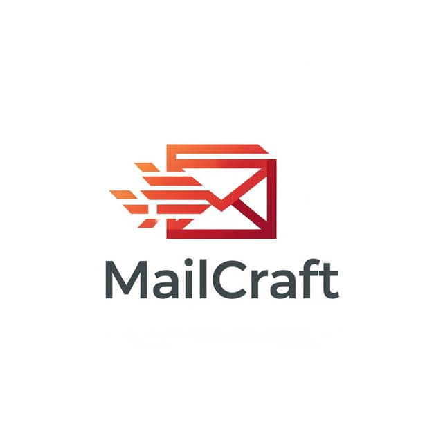
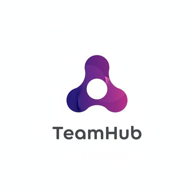
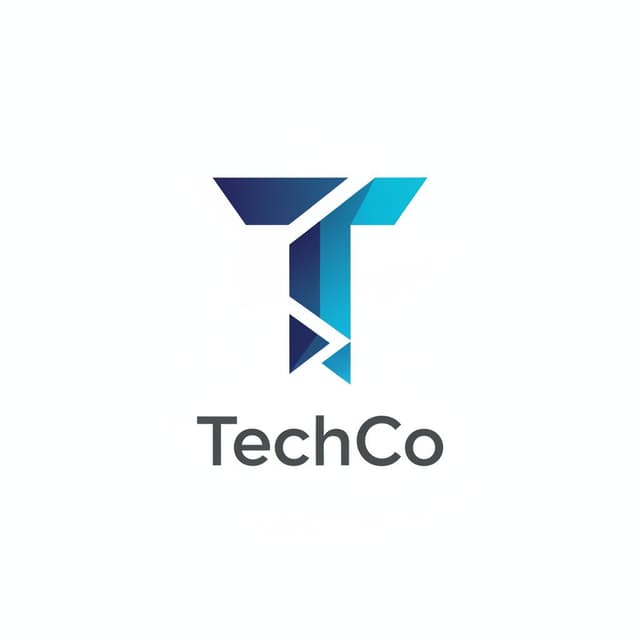
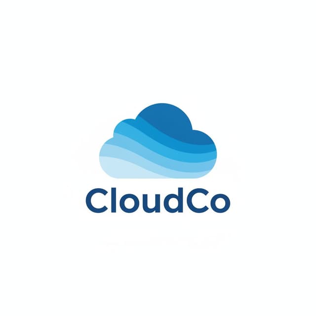
✦ SaaS logos created with GoodLogoAI
Why SaaS Logos Need a Different Approach
SaaS companies face branding challenges that restaurants, retail stores, and agencies never encounter. Your logo must perform across contexts most industries never consider.
B2B Trust at First Glance
Enterprise buyers judge your credibility before they read a single word. A polished, professional logo signals that you're a real company worth booking a demo with. Research consistently shows B2B buyers assess visual credibility in the first 50 milliseconds.
Innovation Signal
In software, looking dated means being dated. Your logo communicates whether you're ahead of the curve or behind it — especially in competitive SaaS categories where perception drives trial rates before prospects even see your product.
10+ Deployment Contexts
Your logo appears in your app UI, browser tab favicon, Chrome extension, mobile icon, email signature, LinkedIn profile, pitch deck, and onboarding screens. Each context has different size and background requirements. Most industries face 3–4 contexts. SaaS faces 10+.
Screen-First, Print-Second
Unlike brick-and-mortar businesses, 95%+ of your brand impressions happen on screens. That means retina displays, dark mode interfaces, and compressed app icon sizes. A logo that looks great on a business card might be unrecognizable as a 32×32 favicon.
Real SaaS Logos Made With Our Generator
8 SaaS Logo Design Principles That Actually Matter
These aren't generic design rules. They're the specific patterns shared by logos that have lasted through hypergrowth — from Slack to Notion to Stripe.
Keep It Clean & Minimal
SaaS logos should be immediately understandable. Complexity confuses. Think Stripe, Dropbox, or Linear — all incredibly simple yet impossible to forget.
Pro tip: If you can't recreate your logo from memory after seeing it once, it's too complex.
Sans-Serif Typography
Sans-serif fonts dominate SaaS because they communicate modernity and clarity on screens. Avoid serifs unless you're explicitly positioning as "heritage enterprise."
Pro tip: Use fonts with multiple weights — your logo needs to adapt from website header to email signature.
Strategic Color Choice
Blue dominates SaaS for trust (Zoom, Dropbox, Salesforce). But breaking the mold with unique colors helps you stand out — Notion's black, Asana's coral, Slack's multi-color.
Pro tip: Check your top 10 competitors. Whatever they all do, either match it (for trust) or flip it (for memorability).
Icon + Wordmark Flexibility
You need both. The icon for app icons and favicons. The wordmark for your website header and marketing. The combination for pitch decks and presentations.
Pro tip: Design the icon first, make sure it works standalone at 16px, then add the wordmark.
Scalability Is Non-Negotiable
Your logo must remain sharp from 16×16px (favicon) to billboard size. Thin lines, small details, and low contrast all fall apart at small sizes. Test at extremes before committing.
Pro tip: View your logo at 16×16px on your phone. Still recognizable? Good. If not, simplify.
Dark Mode Ready
Most developers and technical users prefer dark mode. Your logo must look right on both white and dark backgrounds. Plan for both from day one, not as an afterthought.
Pro tip: Create three versions: full color, all-white, all-black. This covers 99% of use cases.

Avoid SaaS Clichés
The space is drowning in swooshes, orbits, connected nodes, and abstract geometric shapes. These scream "generic tech startup." Memorable brands do the opposite of what's safe.
Pro tip: Google "[your niche] SaaS logos." See what everyone else is doing. Then go a different direction.
Timeless Over Trendy
Gradient mesh and glassmorphism look hot today and dated in two years. SaaS companies need logos that survive through Series A, Series B, and beyond without a rebrand.
Pro tip: Look at logos from 2015 that still look modern. What do they share? Simplicity and restraint.
SaaS Logo Color Psychology
Color isn't aesthetic — it's strategic. Here's what each major color choice communicates to B2B buyers and when to use (or avoid) each.
Blue
42% of SaaS logos
Trust · Reliability · Professionalism
Examples: Zoom, Dropbox, LinkedIn, Salesforce, Atlassian
Best for: Enterprise SaaS, B2B tools, security products, financial software
Avoid when: If your whole competitive set is blue — you'll disappear into the crowd
Purple
12% of SaaS logos
Innovation · Creativity · Premium
Examples: Twilio, Discord, Heroku
Best for: Developer tools, creative platforms, next-generation positioning
Avoid when: Very conservative B2B (finance, legal) where purple can seem too creative
Black / Dark
6% of SaaS logos
Premium · Confidence · Sophistication
Examples: Notion, Vercel, Linear, GitHub
Best for: Developer tools, design tools, premium positioning, sophisticated audiences
Avoid when: Non-technical users who may find black intimidating or cold
Green
8% of SaaS logos
Growth · Success · Positive Momentum
Examples: Basecamp, QuickBooks, Gusto
Best for: Growth tools, financial software, productivity apps, sustainability tech
Avoid when: Security products (green = "go ahead" conflicts with security's "block" metaphor)
What Makes the Best SaaS Logos Work
The most recognized SaaS logos all follow the same underlying logic. Here's what you can steal from each.
Slack
CollaborationThe hashtag icon instantly communicates "channels" — the core metaphor of the product. Multi-color palette reflects diversity and collaboration. Works perfectly at 16px.
Lesson: Use a visual metaphor pulled directly from your product's core concept.
Notion
ProductivityPure black and white minimalism that feels premium and confident. The lego-block icon suggests flexibility and building. Stands out in a sea of colorful productivity apps.
Lesson: You don't need color to be memorable. Confidence and restraint beat loud colors.
Stripe
PaymentsUltra-minimal wordmark, no icon. The typography alone communicates precision and trust — exactly what you want from a payments company. Impossible to mistake for anyone else.
Lesson: Sometimes just perfect typography is enough. No icon needed if the wordmark is strong.
Linear
Project MgmtAn impossible triangle in purple — geometric, mysterious, suggests speed and precision. Appeals to developers who appreciate clever design. Perfect for dark mode.
Lesson: For technical audiences, subtle intelligence in design signals that you respect theirs.
Figma
Design ToolsFive colorful circles arranged to suggest collaboration. Playful yet professional — designers immediately feel at home. Recognizable in browser tabs at 16px.
Lesson: For creative tools, personality and playfulness are features, not risks.
Airtable
DatabasesColorful stacked blocks make databases feel approachable rather than intimidating. The friendly wordmark signals "this is powerful but not scary." Perfect for SMB buyers.
Lesson: Humanize technical products with friendly color and approachable typography.
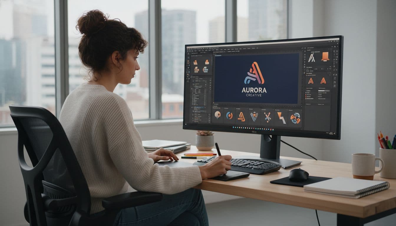
How to Create a SaaS Logo in 4 Steps
Our SaaS logo maker guides you through a process optimized specifically for software companies.
Describe Your SaaS Product
Tell the AI about your software: B2B or B2C? What problem does it solve? Which competitors does it sit near? The more specific your description, the sharper the output.
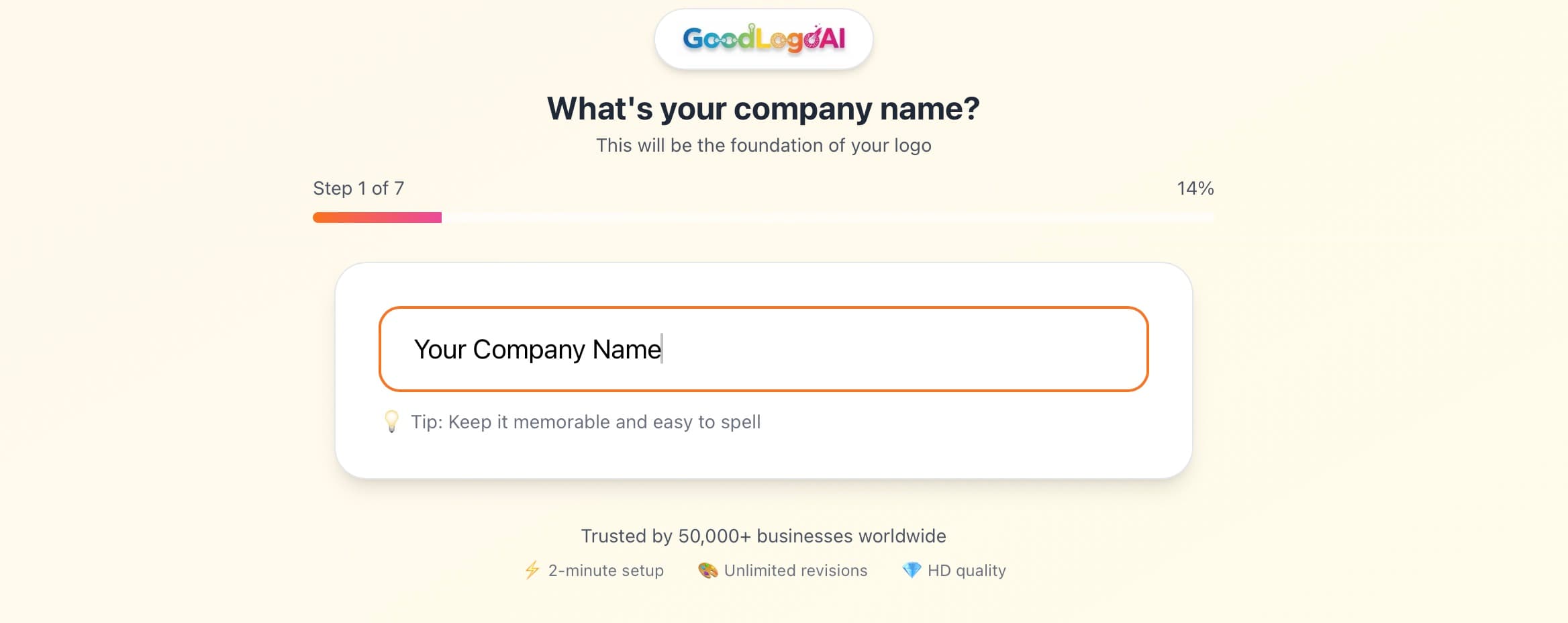
- Mention your target user (developer, marketer, finance team…)
- Name 2–3 competitor logos you admire
- Specify a vibe: minimal like Linear, approachable like Airtable, premium like Notion
AI Generates a SaaS-Optimized Logo
The AI generates a logo using SaaS-specific design principles: scalability, screen optimization, B2B trust signals, and dark-mode compatibility — all baked in by default.
- Colors are chosen based on B2B buyer psychology
- Typography is selected for screen legibility
- Designs are tested against small-size requirements automatically
Refine With AI Edits
Not quite right? Tell the AI what to change in plain English. "Make it more minimal like Stripe," "go darker," "try a geometric icon instead." It understands SaaS design language.
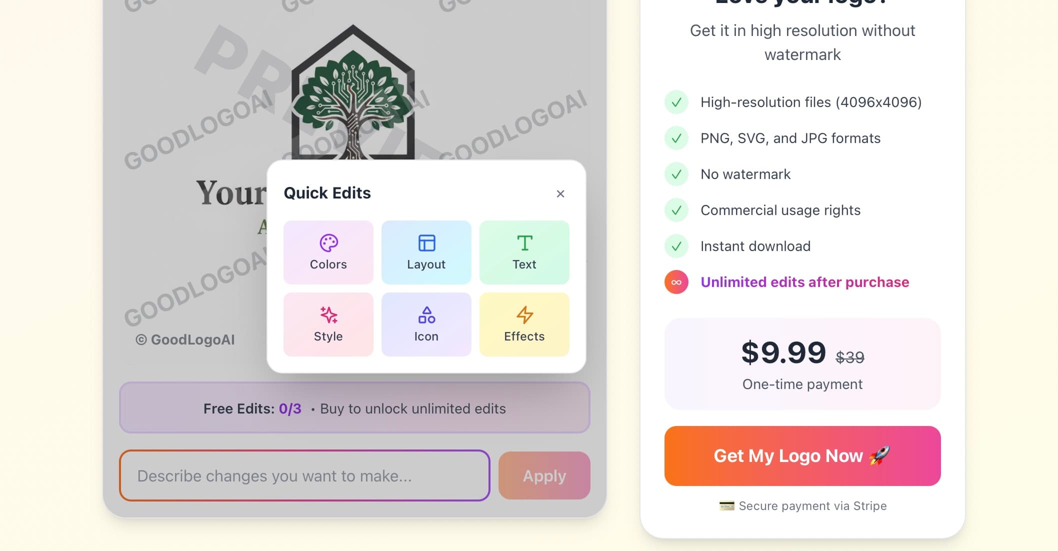
- Try it free 3 times — no credit card needed
- Reference specific SaaS logos for style direction
- Test the result at small sizes before finalizing
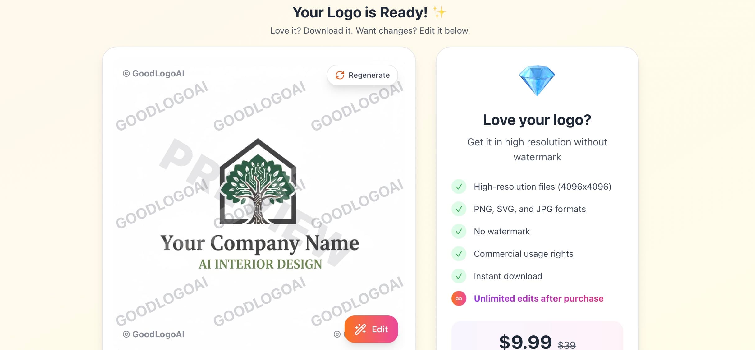
Download All Formats
One $9.99 payment gets you SVG (infinite scaling), high-res PNG with transparency (2048×2048px upscaled), and JPG. Everything you need for your app, website, and pitch deck.
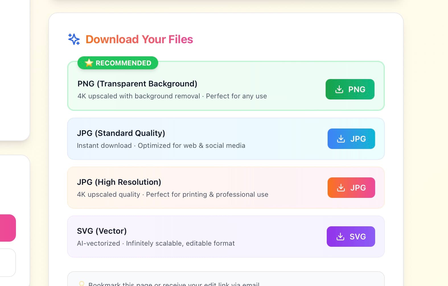
- SVG for engineers to use in code
- PNG transparent for overlays and app UI
- JPG for investor decks and documentation
Try free · $9.99 to download · 30-day guarantee
SaaS Logo Do's and Don'ts
Do These
✅ Test at 16×16 pixels
Your logo lives in browser tabs and favicons. If it's unrecognizable at tiny sizes, redesign it.
✅ Create icon + wordmark versions
Plan for both from the start. Icon for app UI, wordmark for marketing, combo for decks.
✅ Check competitor logos first
Know what color and style your space uses — then decide whether to match or differentiate.
✅ Design for dark mode
White, black, and colored background versions. SaaS products run on dark UIs.
✅ Keep it simple
Stripe, Notion, Linear — all incredibly simple. Simplicity scales. Complexity doesn't.
✅ Think 5+ years out
Your logo should survive through Series A without a rebrand. Classic beats trendy.
Avoid These
❌ Don't use cliché tech symbols
Swooshes, orbits, connected nodes, abstract clouds — these scream generic startup and blend into the sea of sameness.
❌ Don't ignore scalability
Thin lines and small details fall apart at 16px. Always test at small sizes before committing.
❌ Don't over-complicate it
Your logo isn't an art project. If it takes 5 seconds to understand, it's too complex.
❌ Don't use red as primary
Red signals errors and warnings in software UI. Using it as your brand color creates subconscious negative associations.
❌ Don't forget B2B buyers
You might love a playful cartoon style, but will a VP of Engineering take you seriously? Know your audience.
❌ Don't use heavy gradients
Complex gradients look great at large sizes but become muddy blobs in favicons. Test before committing.
Every SaaS Brand Personality, Covered
From minimal developer tools to bold consumer SaaS — our logo maker adapts to your positioning.
Minimal
Modern
Bold
Elegant
Tech
Creative
Corporate
Startup
10,000+
SaaS Logos Created
2 min
Average Creation Time
$9.99
One-Time Payment
4.9 / 5
User Rating
Trusted by SaaS Founders
"Needed a B2B SaaS logo fast. GoodLogoAI understood exactly what works for enterprise software. Got something professional in literally 3 minutes."
Sarah Chen
Founder, CloudMetrics
"As a developer, I loved that it generated a perfect 512×512 app icon AND a horizontal wordmark automatically. Saved me hours of back-and-forth with designers."
Marcus Rodriguez
CTO, DevTools Inc.
"We were about to spend $5K on a branding agency. Tried this first and our investors loved the logo. Saved weeks and $5,000."
Jenny Liu
CEO, FinTech Startup
SaaS Logo Design — Frequently Asked Questions
What makes a SaaS logo different from other logos?
SaaS logos need to work at extreme sizes (16px to 20 feet), communicate trust to B2B buyers, look modern and innovative, work on dark mode, and function as both icon and wordmark. Most other industries don't face these requirements. Your logo lives primarily in digital spaces, so it must be optimized for screens, not print.
Should my SaaS logo be blue like everyone else's?
Blue is popular in SaaS because it communicates trust — and in B2B, trust matters. However, if you want to stand out, consider purple (innovation), black (premium), or orange (energy). Look at your competitors: if they're all blue, you have two choices: use blue to signal legitimacy, or use a different color to be memorable. Both strategies work.
Do I need a separate icon and wordmark for my SaaS?
Yes. You'll use the icon for app icons, favicons, social media profiles, and within your UI. You'll use the wordmark for your website header, email signatures, and documents. You'll use the combination for pitch decks, presentations, and marketing materials. Having only one limits your flexibility significantly.
How can I make sure my SaaS logo works in dark mode?
Create three versions: full color (for light backgrounds), all white (for dark backgrounds), and all black (for special uses). Test each on both white and black backgrounds. GoodLogoAI automatically provides these variations when you download. Never assume your full-color logo will work on all backgrounds.
What file formats do I need for a SaaS logo?
You need: SVG (vector format for infinite scaling — critical for SaaS), PNG with transparency (for websites and apps), and JPG (for documents and presentations). At minimum 2048×2048px, but 4096×4096px is better. You'll also want specific sizes: 16×16, 32×32, 180×180, and 512×512 for various app icon requirements.
How much should I spend on a SaaS logo?
Pre-revenue startups: $10–100 (AI logo generators like GoodLogoAI). Seed stage ($500K–$2M raised): $2,000–$5,000 (freelance designer). Series A+ ($5M+ raised): $10,000–$50,000 (design agency with full brand system). Many successful SaaS companies started with simple, affordable logos and rebranded later when it made financial sense.
Should my SaaS logo include an illustration or icon?
It depends on your market position. Abstract geometric shapes work for B2B SaaS (they feel professional). Friendly icons work for SMB-focused tools (they feel approachable). Avoid literal illustrations — a literal cloud for cloud software feels generic. The best SaaS logos use abstract shapes that suggest what you do without being obvious about it.
How do I test if my SaaS logo is effective?
Run these five tests: 1) View it at 16×16px — can you recognize it? 2) Show it to someone for 5 seconds then ask them to draw it. 3) Put it next to your competitors — does it stand out? 4) Test on white, black, and colored backgrounds. 5) Place it in your actual product UI — does it feel right? If it passes all five, you have a winner.
Can I trademark an AI-generated SaaS logo?
Yes. As long as you own the commercial rights (which you get with GoodLogoAI), you can trademark your logo. The USPTO doesn't distinguish between AI-generated and human-designed logos — what matters is that it's unique and you own the rights. Always do a trademark search before filing to ensure there are no conflicts.
What if my SaaS pivots — should I keep the same logo?
It depends on how different the pivot is. Same market, different product? Keep the logo — brand recognition matters. Completely different market? Consider rebranding. Many successful SaaS companies (Slack, Notion) kept their logos through significant product evolution. Your logo represents your company, not just your current product.
Written by the GoodLogoAI Team • Updated July 2026
Guidance drawn from designing thousands of SaaS logos and studying category-leading software brands.
Ready to Create Your SaaS Logo?
Join 10,000+ SaaS founders who created a professional logo in minutes — not weeks. Free to try, $9.99 to download all formats.
No signup • SVG + PNG + JPG • 30-day guarantee