Startup Logo That Earns Trust Before You Speak
Create a professional startup logo in 2 minutes — investor-ready for your pitch deck, affordable for your bootstrapped budget. Built for early-stage founders who need something great, fast, without burning runway.
What Is a Startup Logo?
A startup logo is the icon and wordmark a young company uses to represent itself before it has years of brand recognition to lean on — on its landing page, in cold emails, on social profiles, and in front of investors in a pitch deck. Unlike an established brand's logo, a startup logo has to do double duty: look credible enough to earn trust in seconds, while staying cheap and fast enough to ship before the company even knows its final direction. That tension — professional but not overbuilt — is what makes startup logo design its own discipline.
2 min
Average creation time
$9.99
One-time, no subscription
SVG
Infinite-scale vector file
30-day
Money-back guarantee
✦ Startup logos created with GoodLogoAI

Logos like these take under 2 minutes to create with GoodLogoAI. No design skills needed.
Free to try · $9.99 to download SVG + PNG
Why Your Startup Logo Matters More Than You Think
A logo isn't decoration. For startups, it's a credibility signal that works 24/7 — on your landing page, in your pitch deck, in every email you send.
Investors Notice Everything
When a partner opens your pitch deck, they're evaluating a hundred signals simultaneously — and your logo is one of them. A polished brand says 'this founder sweats the details.' An amateur one creates doubt before you've said a word.
You Need It Yesterday
Startups can't wait 6 weeks for a design agency. Your landing page goes live this week. Your cold email campaign starts tomorrow. Your demo day is next month. You need something great, fast — not a placeholder you'll be embarrassed by.
Stretch Every Dollar — But Don't Look Cheap
Pre-revenue, $5,000 for a branding agency is absurd. But a free Canva logo that looks like a free Canva logo hurts more than having no logo at all. There's a middle ground: professional quality at startup prices.
Pivot-Proof From Day One
Most startups change direction in their first two years. A logo built around your current product feature becomes a liability when you pivot. Get something name-based or abstract that survives the evolution of your company.
What Makes a Great Startup Logo?
After looking at hundreds of successful startup logos — from YC batches to unicorn companies — the same patterns show up every time.
Drawable from memory
If someone can't roughly sketch it after seeing it once, simplify.
Works at 16×16px
Legible as a favicon, app icon, and Slack workspace image.
No trendy effects
Glassmorphism looks dated in 24 months. Simple lasts 10 years.
Name-based or abstract
Survives pivots. Literal product icons often become liabilities.
Consistent at all sizes
From a landing page hero to a business card corner to a billboard.
Three color variants
Full color, all-white, all-black. Covers 99% of deployment contexts.
No clichéd symbols
No rockets, no lightbulbs, no upward arrows. Be the company, not the concept.
Story potential
A logo with meaning gives journalists and investors something to talk about.
Best Affordable Logo Options for Bootstrapped Startups
The right logo budget depends entirely on your stage. Spending $5,000 pre-revenue is wasteful. Spending $100 post-Series-A looks careless. Here's the honest breakdown.
AI Logo Maker (GoodLogoAI)
You're validating, not scaling. Spend $0–100 max. Get something professional that passes the 'credible founder' test. Upgrade later when you have revenue.
Freelance Designer (Dribbble, Behance)
You've validated the business. Now invest in a designer who'll create a cohesive brand system — icon, wordmark, color palette, typography guide.
Brand Agency (full system)
At this stage, brand becomes a strategic asset. A design agency delivers brand strategy, full visual identity, guidelines, and rollout support across all touchpoints.
GoodLogoAI is purpose-built for the first tier — professional quality at bootstrap prices. Most founders use it to get to market fast, then invest in full brand design after product-market fit.
8 Design Principles Every Startup Logo Needs
These aren't generic design rules. They're patterns extracted from startup logos that have survived funding rounds, pivots, and hypergrowth.
Simple Enough to Sketch From Memory
Nike. Apple. Stripe. All drawable in under 5 seconds. If someone can't roughly sketch your logo after seeing it once, it's too complex. Simplicity isn't laziness — it's the hardest design discipline to master.
Practical test: Show your logo to three people. Ask them to draw it 10 minutes later. If they can't, simplify.
Works at 16px (Favicon Test)
Your logo lives in browser tabs, app stores, Slack workspaces, and email signatures. These are tiny. Details that look great at 300px become indistinguishable mud at 16px. Design for the smallest size first.
Practical test: Paste your logo into a 16×16 canvas. Still recognizable? Great. If not — simplify the icon.
Credible, Not Corporate
Startup logos need to thread a needle: professional enough that investors take you seriously, but not so polished it looks like you blew your runway on branding. The sweet spot looks like $5K of design work — regardless of what you actually paid.
Practical test: Ask someone outside your industry: "Does this company look fundable?" Trust their gut reaction.
Avoid the Startup Clichés
Rockets, lightbulbs, upward arrows, gears, circuit boards, abstract geometric hexagons — investors have seen all of these ten thousand times. These symbols say 'generic startup' not 'specific company solving a specific problem.' Be the company, not the concept.
Practical test: Search your industry + "startup logo" on Google Images. Whatever fills the screen — avoid it.
Pivot-Resistant Design
40% of startups change direction within the first 18 months. A logo tied to a specific product feature or literal business description becomes a liability if you pivot. Abstract or name-based logos survive pivots. Literal icons often don't.
Practical test: Would this logo still make sense if you changed your product but kept the company name?
Dark Mode + Pitch Deck Ready
Your logo goes on white websites, dark slide decks, light-mode apps, and dark-mode apps. You need three versions: full color, all-white, and all-black. Founders who only have one version scramble every time they need to use the logo somewhere new.
Practical test: Create all three versions before launch. GoodLogoAI provides them automatically.
Icon AND Wordmark
App icons, favicons, Slack bots, and product UI need the icon. Website headers, pitch decks, and email signatures need the wordmark. You'll use both constantly. Designing only one is like building a product with half the features — it works, but it's limited.
Practical test: Design the icon first. If it works standalone at small sizes, add the wordmark. Not the other way around.
Timeless Over Trendy
Glassmorphism. Gradient mesh. Neobrutalism. Every year has a hot design trend. Every year, logos that chased that trend start looking dated 24 months later. Startups need logos that survive through seed, Series A, Series B — that's 5+ years minimum.
Practical test: Look at logos from 2015 that still look modern. What do they share? Restraint and simplicity.
Startup Logo Color Psychology
The color you choose positions your startup before a prospect reads a single word. Here's what each major choice signals — and which startups have used each effectively.
Blue
Trust · Stability
Examples: Stripe, Coinbase, Dropbox, LinkedIn
Best for: Fintech, B2B SaaS, security, enterprise
Black
Premium · Confidence
Examples: Notion, Linear, Vercel, GitHub
Best for: Developer tools, premium SaaS, sophisticated audiences
Purple
Innovation · Creative
Examples: Discord, Twilio, Heroku
Best for: Dev tools, creative platforms, next-gen positioning
Orange / Coral
Energy · Approachable
Examples: Product Hunt, Zapier, GitLab
Best for: Consumer apps, community products, developer-friendly tools
What the Best Startup Logos Have in Common
Not case studies — lessons. What each famous startup logo got right that you can apply today.
Stripe
PaymentsUltra-minimal wordmark. No icon. Pure typography communicating precision — exactly right for a payments company. Has barely changed since 2011 because it was timeless from day one.
What to steal: Sometimes perfect typography is enough. You don't need an icon if the wordmark is strong.
Notion
ProductivityPure black and white with a lego-block icon suggesting flexibility and building. Stands out in a sea of colorful productivity tools. The restraint is the statement.
What to steal: Color is optional. Confidence and restraint can be more memorable than a rainbow palette.
Airbnb
TravelThe 'Bélo' symbol represents belonging — a person, a location pin, a heart, and the letter A all in one shape. Has a story that PR teams can retell forever.
What to steal: A logo with a built-in story gives you PR ammunition. The meaning amplifies the design.
Linear
Dev ToolsAn impossible geometric shape in deep purple — technical, precise, fast. Appeals directly to developers who appreciate clever design hidden in apparent simplicity.
What to steal: For technical audiences, subtle intelligence in design signals respect for theirs.
Discord
CommunityGaming-friendly mascot that works at 16px, feels approachable and fun, and has stayed recognizable through hypergrowth from gaming niche to mainstream communication platform.
What to steal: A strong icon can survive a complete product pivot. Discord went from gaming to everything.
Figma
DesignFive colorful overlapping circles suggesting collaboration. Playful yet professional — designers immediately feel at home. Perfect at 16px and in their app UI.
What to steal: For creative tools, personality and playfulness are features, not risks.
How to Create a Startup Logo in 4 Steps
No design skills needed. The AI understands startup brand language — just describe what you're building.
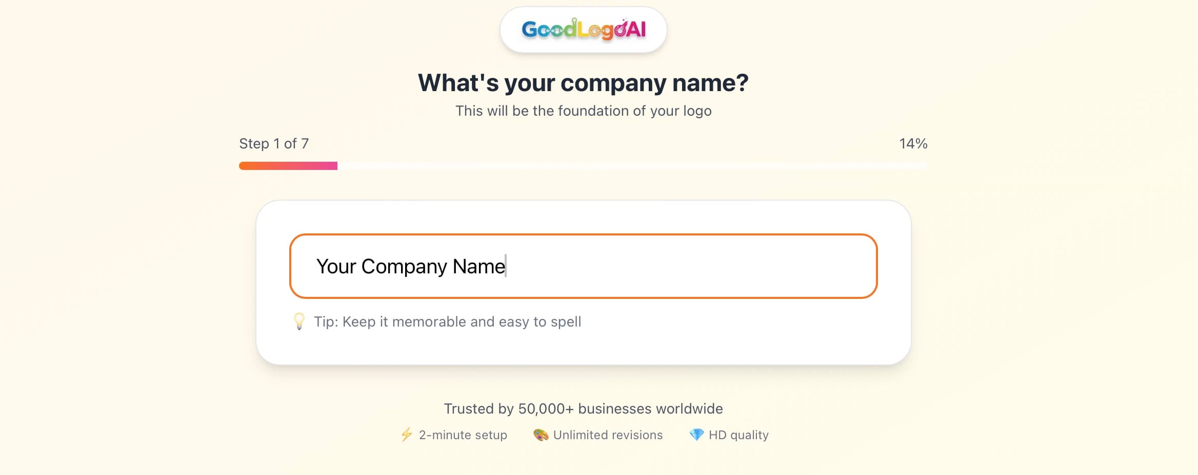
Describe Your Startup
Tell the AI what your company does, who it's for, and the vibe you want. The more specific, the better. 'B2B project management tool for remote engineering teams, clean and modern like Linear' beats 'tech startup logo.'
- Name 1–2 logos you admire and explain why
- Mention your target user (developer, founder, enterprise buyer)
- Specify a tone: serious/professional vs playful/approachable
AI Generates Startup-Optimized Designs
The AI applies startup-specific design principles automatically: scalability, credibility, dark mode compatibility, and pitch-deck readiness. It skips the rocket ships by default.
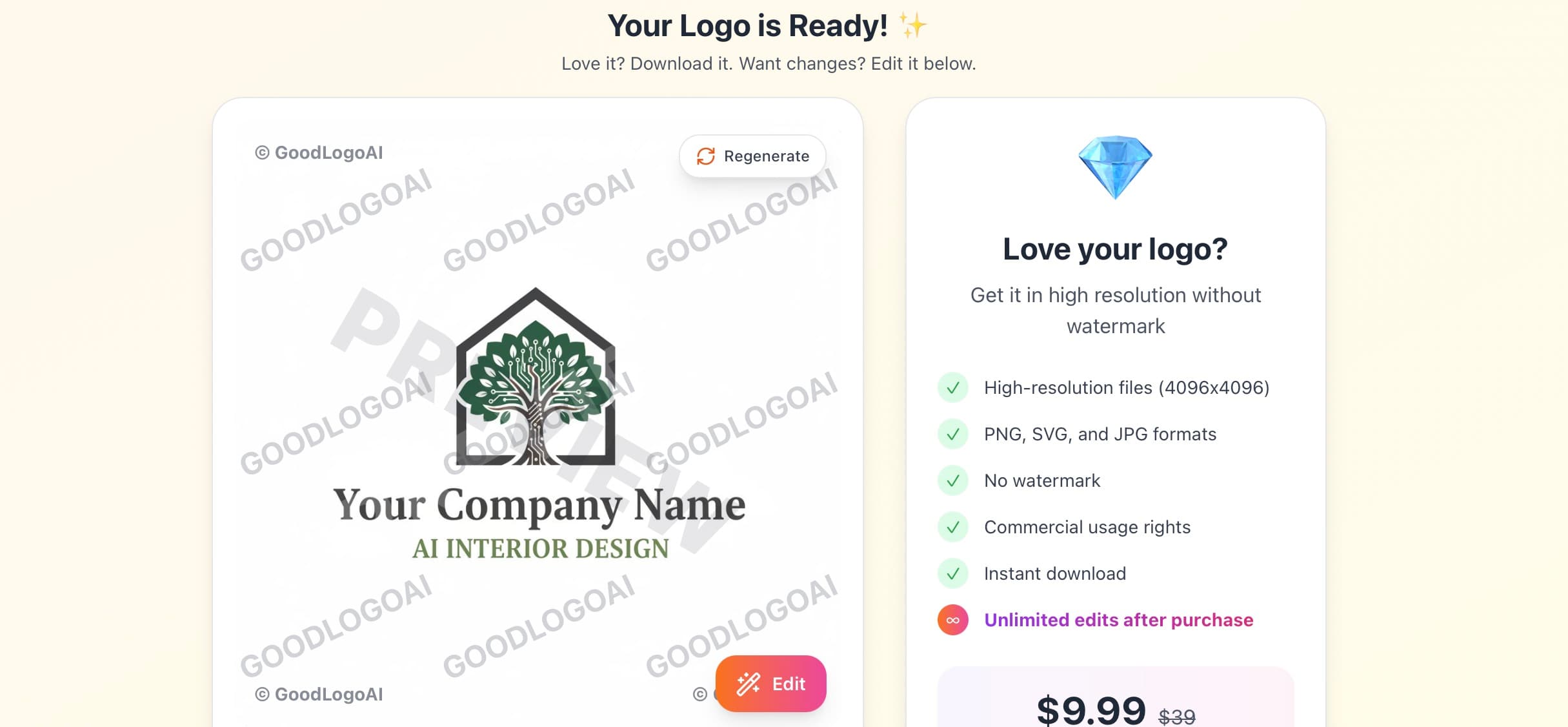
- Startup-appropriate color palette selected automatically
- Icon sized to work at 16px from the start
- Multiple style variants generated
Refine With Plain-English Prompts
Not exactly right? Tell the AI what to change. 'More minimal like Stripe,' 'darker, feels more premium,' 'try without an icon, just wordmark.' It understands startup design language.
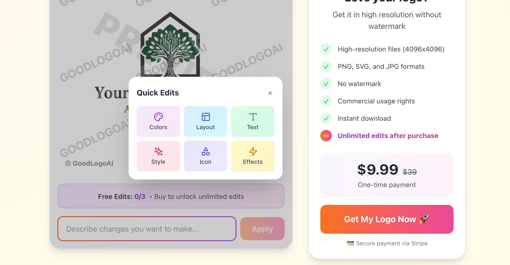
- Try free 3 times — no card needed
- Reference specific brands for direction
- Test the result at small sizes before finalizing
Download Everything You Need
One $9.99 payment gets you SVG (infinite scaling for your dev team), high-res PNG with transparent background, and JPG — plus white and black variants. Everything your pitch deck, website, and app needs.
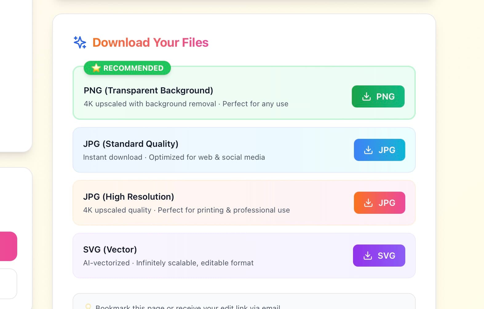
- SVG for developers to use in code
- Transparent PNG for pitch deck overlays
- White variant for dark slides and dark-mode UI
Try free · $9.99 to download · 30-day guarantee
Startup Logo Do's and Don'ts
Do These
✅ Test at favicon size (16×16px)
If it doesn't work in a browser tab, it's too complex for a startup logo.
✅ Get icon AND wordmark
You'll need both. Design the icon first; make sure it works standalone.
✅ Design for dark mode
Pitch decks, developer tools, and many apps run on dark backgrounds.
✅ Keep it abstract or name-based
Survives pivots. Literal product icons become liabilities.
✅ Ask non-designers for feedback
Does it look "fundable"? Do they remember it 10 minutes later?
✅ Start affordable, upgrade later
AI at pre-revenue. Freelancer at seed. Agency at Series A.
Avoid These
❌ Don't use rockets or lightbulbs
Investors see these in 90% of decks. You need to stand out, not blend in.
❌ Don't use trendy design effects
Glassmorphism, 3D gradients, neobrutalism — all look dated within 2 years.
❌ Don't design around a product feature
When you pivot (and you might), a product-specific logo becomes a liability.
❌ Don't spend $5K pre-revenue
Nobody has ever failed to fundraise because their logo was "only $100."
❌ Don't use multiple fonts
One typeface max. Two is pushing it. Three is chaos.
❌ Don't delay your launch for a logo
Good enough now beats perfect later. Ship, then iterate.
What Founders Say
"Used GoodLogoAI the night before our YC interview. Investor literally said 'your branding looks sharp.' $9.99 well spent."
Alex K.
Early-stage Founder
"As a solo founder with $0 design budget, I needed something that looked real. Got it in 8 minutes. Launched the next day."
Sarah C.
Solo Founder
"We've pivoted twice. The logo survived both pivots because it was abstract. Best early decision we made."
Marcus W.
SaaS Startup CEO
Startup Logo Design — Frequently Asked Questions
What makes a great startup logo?
A great startup logo is simple enough to work at 16px (favicon), memorable after one glance, scalable from landing page to pitch deck, and free of design clichés like rockets and lightbulbs. It should feel credible to investors while being distinct enough to stand out. The best startup logos — Stripe, Notion, Linear — are almost shockingly simple.
How much should a bootstrapped startup spend on a logo?
Pre-revenue bootstrapped startups should spend $10–100 on an AI logo maker like GoodLogoAI. At seed stage ($500K–$2M raised), budget $1,000–$3,000 for a freelance designer. At Series A+, a full brand system from an agency costs $10,000–$50,000. Most successful startups started with affordable logos and upgraded when it made financial sense.
Do investors really judge startups by their logo?
Investors form impressions of a startup's competence within seconds of seeing the brand. A polished logo signals that founders care about detail and understand their market. An amateur logo doesn't kill a deal on its own, but it creates doubt. At equal merit, the team with better branding wins.
Should a startup logo include a rocket ship or lightbulb?
No. Rocket ships, lightbulbs, gears, and upward arrows are the most overused symbols in startup branding. They communicate 'generic startup' rather than a specific company. Investors see thousands of pitches with the same symbols. Stand out with something that reflects your specific product or positioning, not the concept of 'startups' in general.
What colors work best for a startup logo?
Blue communicates trust (great for fintech, B2B, security). Black signals premium and confidence (Notion, Vercel, Linear). Purple suggests innovation (Twilio, Heroku). Orange and coral convey energy and approachability. Check your top competitors' colors, then either match them to signal credibility or differentiate to be memorable.
How do I make my startup logo work in a pitch deck?
For pitch decks, you need a high-res PNG with transparent background (so it layers over any slide color), an all-white version for dark slides, and an all-black version for light slides. Make sure the logo is legible at small sizes — many founders put it in the corner of slides where it shrinks to under 100px. GoodLogoAI provides all these variants automatically.
Should I get an icon and wordmark or just a wordmark?
Get both from the start. The icon is critical for app icons, favicons, social media profiles, and product UI where space is limited. The wordmark is for your website header, email signatures, and documents. The combination works for pitch decks and presentations. Having only a wordmark limits you significantly as you grow.
When should a startup rebrand or update its logo?
Most early-stage startups should avoid rebranding unless they've pivoted to a completely different market. Consistency builds brand equity. A rebrand signals instability to investors and confuses early customers. The right time to rebrand is after significant market traction, when entering a new market segment, or when the original logo was genuinely poor quality from day one.
Can I trademark an AI-generated startup logo?
Yes. As long as you own the commercial rights (which you do with GoodLogoAI's paid download), you can trademark your logo. The USPTO doesn't distinguish between AI-generated and human-designed logos. Always run a trademark search first — check USPTO.gov — to ensure no conflicts exist.
What file formats does a startup need for its logo?
Essential: SVG (for developers and infinite scaling), PNG with transparent background at 2048×2048px (for web and apps), and JPG (for documents and presentations). Also useful: 512×512px for app icons, 180×180px for iOS/favicon, and white/black single-color versions for overlays. GoodLogoAI provides SVG, PNG, and JPG in one download.
Written by the GoodLogoAI Team • Updated July 2026
Guidance drawn from designing thousands of startup logos and studying category-defining founder brands.
Your Startup Logo Is 2 Minutes Away
Join early-stage founders who got a professional logo without burning runway. Free to try, $9.99 to download SVG + PNG + JPG.
No signup • SVG + PNG + JPG • 30-day guarantee