An Ecommerce Logo That Earns the Click
Create a professional logo for your online store in 2 minutes — built for Shopify, Etsy, and Amazon sellers who need something trustworthy, mobile-ready, and packaging-ready fast.
What Is an Ecommerce Logo Maker?
An ecommerce logo maker is a tool that generates a store's visual identity without hiring a designer — you describe what you sell and who you sell to, and it produces an icon and wordmark ready for your website, social profiles, and packaging. GoodLogoAI's version is built specifically for online sellers: it accounts for how a logo shrinks to a 32-pixel favicon, how it needs to survive a cheap single-color print run on a shipping box, and how color choice actually shifts buyer psychology by category. That's different from a generic logo generator that treats every business the same.
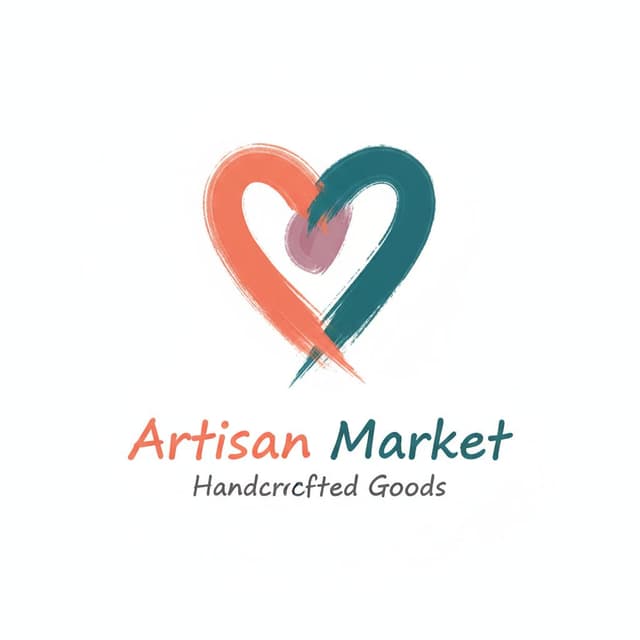
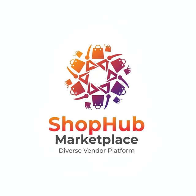
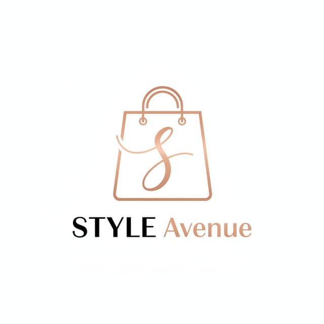
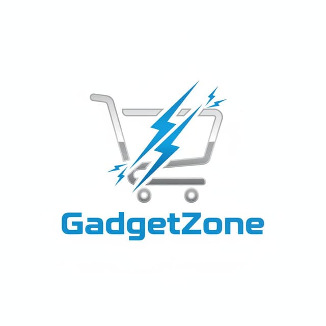
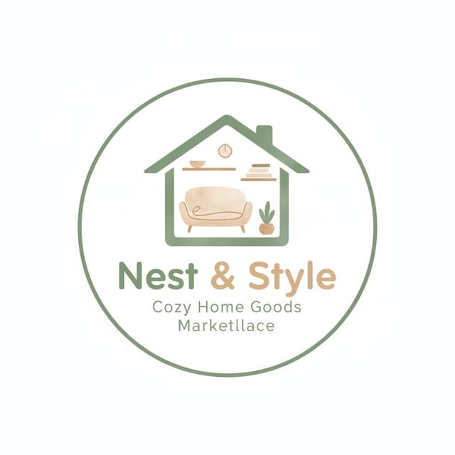
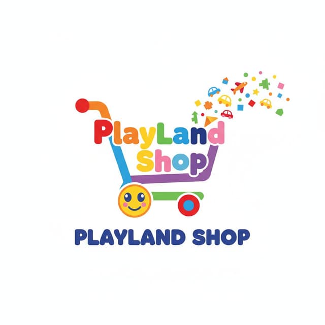
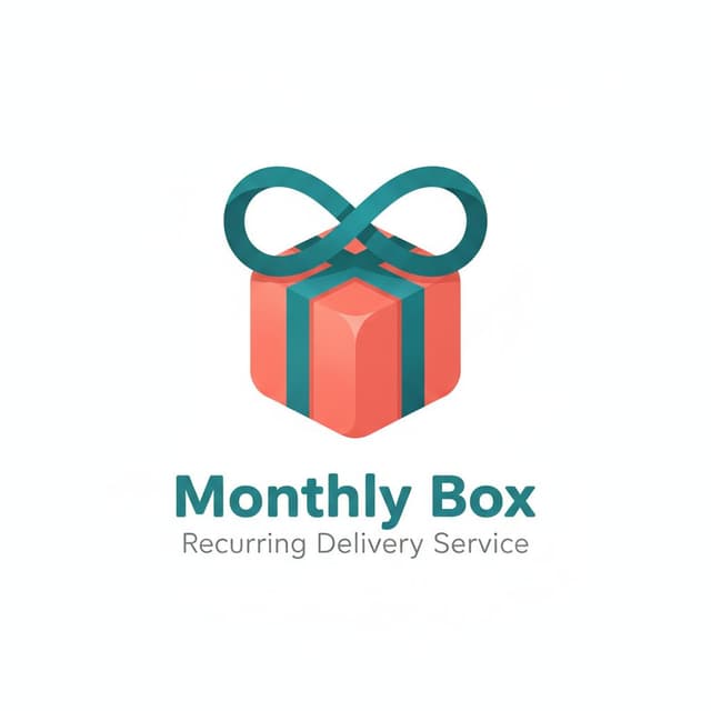
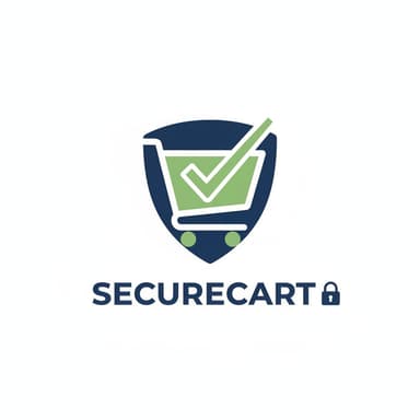
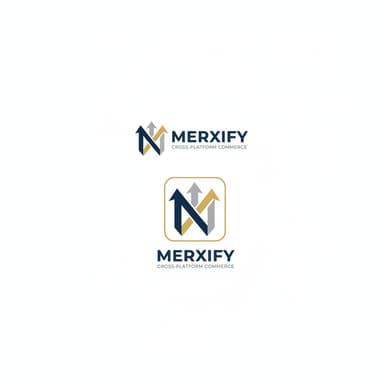
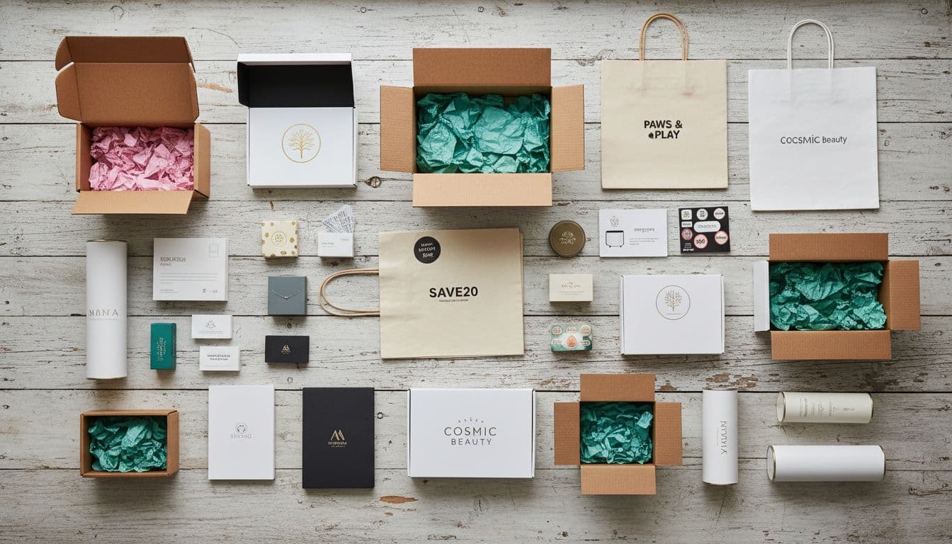
✦ Ecommerce logos created with GoodLogoAI
Why Ecommerce Logos Need a Different Approach
Online shopping is built entirely on trust between strangers who never meet. Your logo carries more of that weight than it would for a business customers can walk into.
Trust Has to Be Instant
Customers can't touch your product or meet you before they pay. Your logo is often the first — and sometimes only — signal of legitimacy they get before entering a card number. A polished mark lowers that friction; an amateur one raises it.
Most Shoppers Are on Mobile
The majority of online browsing and buying happens on a phone screen — in a tiny profile photo, a push notification, a checkout header. A logo that only works large is a logo that fails most of your actual traffic.
You're Competing in a Crowded Feed
Whether you sell on Amazon, Etsy, or your own site, you're one of thousands of similar listings a shopper scrolls past. A distinct, memorable mark is what makes someone tap on yours instead of a competitor's.
It Has to Survive Print, Not Just Screens
Your logo eventually ends up on a shipping box, a sticker, or a tag — printed cheaply, often in one color. A design that only looks good as a high-res PNG can fall apart the moment it hits real packaging.
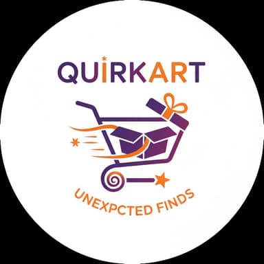
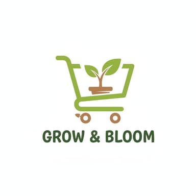
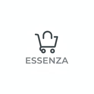
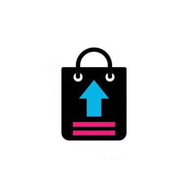
Real Ecommerce Logos Made With Our Generator
8 Ecommerce Logo Design Principles That Actually Matter
Not generic design rules — the specific patterns shared by online stores that convert browsers into buyers, from small Etsy shops to major retailers.
Memorable at a Glance
Shoppers scroll past hundreds of stores a day. Your logo has to register in the half-second before they swipe past — think Amazon's arrow or Etsy's simple orange wordmark, not an intricate illustration nobody has time to decode.
Pro tip: Show it for three seconds, then ask someone to describe it from memory. If they can't, simplify.
Trust-Building, Not Trendy
Online shoppers can't hold your product or meet you in person — your logo is doing the reassuring. Clean typography and a settled, deliberate composition read as legitimate. Anything that looks rushed or clip-art-ish undercuts that.
Pro tip: Ask yourself honestly: would you enter your card details on a site with this logo?
Fits Your Category
A logo should give a subtle hint about what you sell before anyone reads your name. Fashion, tech, and food brands all carry different visual language — matching that expectation (while still standing out) helps shoppers trust their first impression.
Pro tip: Look at 10 competitor logos. Your logo should feel like it belongs in that category without blending in.
Built for Mobile
Most ecommerce browsing happens on a phone — in a tiny Instagram profile circle, a mobile checkout header, a push notification icon. A logo that only looks good at billboard size is a logo that fails your actual customers.
Pro tip: View your logo as a 64×64px icon. Still clearly readable? If it blurs into mush, simplify the shapes.
Strategic Color, Not a Guess
Color shapes how a product feels before anyone reads a word of copy — black skews premium, blue skews trustworthy, red and orange create urgency. Pick a color because it fits your category and price point, not because it happened to look nice on screen.
Pro tip: Luxury goods lean black or deep tones. Everyday essentials lean blue. Impulse buys lean warm and bright.
Works in Every Format
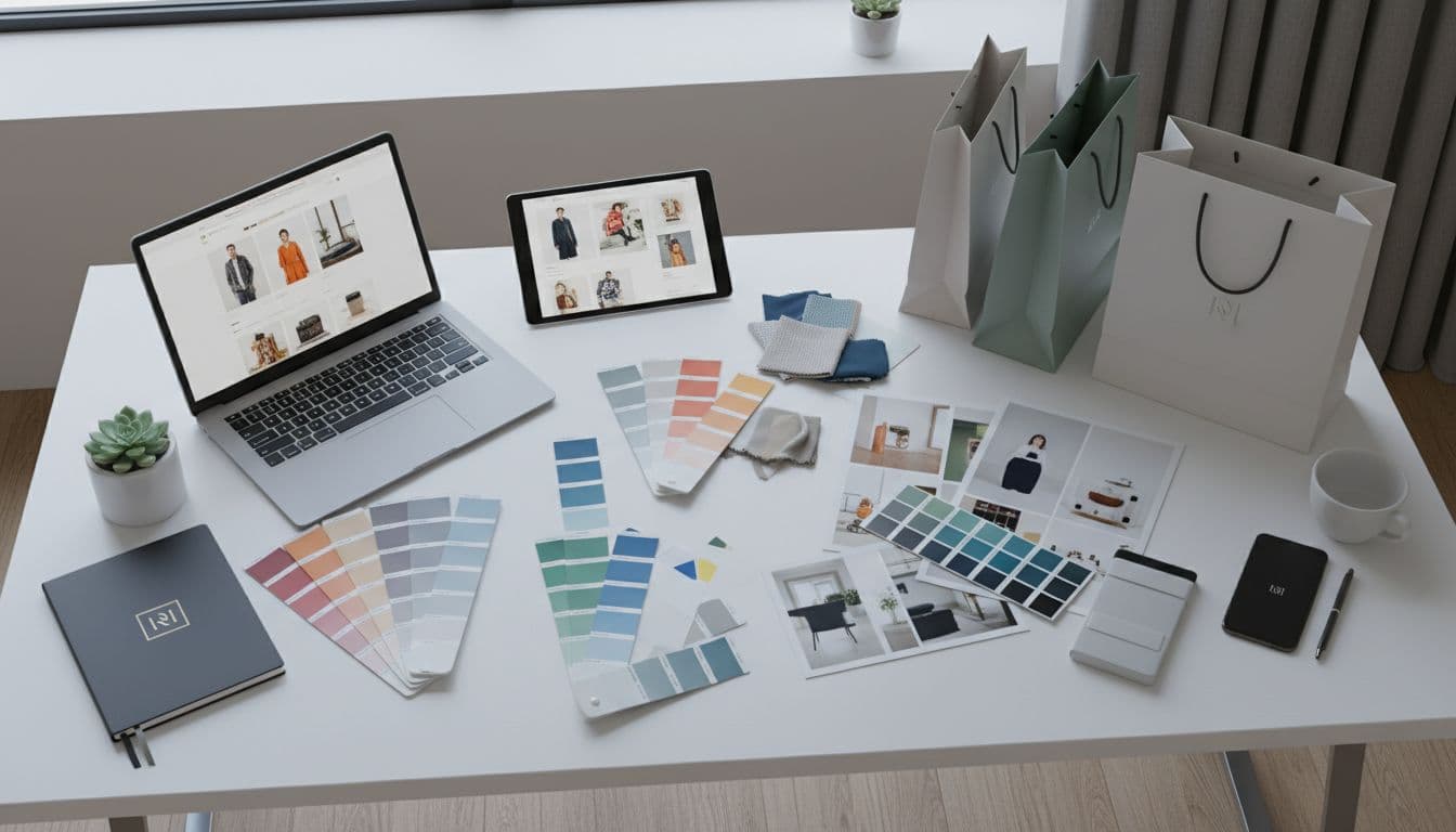
Your logo shows up as a square profile picture, a horizontal website header, a stacked mark on a shipping box, and a single-color print on a poly mailer. Plan for all four layouts from day one instead of retrofitting later.
Pro tip: Design an icon-only version, a horizontal lockup, and a stacked version before you finalize anything.
Print-Ready From Day One
Unlike a purely digital brand, an ecommerce logo eventually ends up on a box, a sticker, or a tag. Complex gradients and fine detail that look great on a Retina screen often turn muddy on a cheap print run.
Pro tip: Convert your logo to solid black. If it still reads clearly, it will print well on packaging.
Built to Last, Not to Trend
A logo tied to this year's aesthetic — a specific gradient mesh, a trendy hand-drawn font — tends to look dated within two years. Your packaging, product photos, and brand equity are all easier to maintain with something that ages slowly.
Pro tip: Look at ecommerce logos from a decade ago that still feel current. They're almost always simple and restrained.
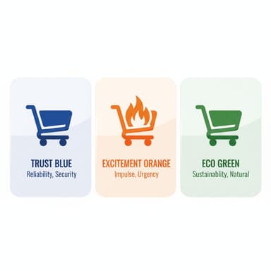
Ecommerce Logo Color Psychology
Color shapes how shoppers feel about a product before they read a word of copy. Here's what each major choice signals — and which categories it fits.
Black
Luxury · Premium · Sophistication
Examples: Chanel, Nike, Away, many premium DTC brands
Best for: High-ticket products, designer goods, premium beauty, anything positioned above $100
Blue
Trust · Reliability · Security
Examples: PayPal, Walmart, Best Buy, Shopify
Best for: Electronics, general merchandise, anything where payment trust matters most
Red / Orange
Urgency · Energy · Impulse
Examples: Target, Etsy, Amazon accents
Best for: Fast fashion, flash sales, impulse-buy categories, food and drink
Green
Natural · Organic · Health
Examples: Whole Foods, Patagonia, wellness and sustainable brands
Best for: Organic goods, sustainable fashion, wellness, natural beauty
What Makes the Best Ecommerce Logos Work
Successful online store logos all follow the same underlying logic. Here's what you can borrow from each.
Amazon
MarketplaceThe arrow running from A to Z hints they sell everything alphabetically, and it doubles as a smile — a quiet nod to customer satisfaction. Reads clearly even at favicon size.
Lesson: A logo can tell a small story through shape alone, without ever needing to spell it out.
Etsy
Handmade MarketplaceA warm orange wordmark that feels handmade without looking unprofessional — friendly enough to invite browsing, polished enough to trust with a payment.
Lesson: Match your brand personality to your marketplace. Etsy needed to feel human, not corporate.
Glossier
BeautyClean black wordmark on soft pink. Minimalist to the point of feeling premium, and built to photograph well on Instagram — which was always the point.
Lesson: Sometimes restraint is the luxury signal. Glossier's simplicity is the whole brand.
Warby Parker
EyewearA vintage-inspired serif wordmark, no icon needed. Feels sophisticated without being unapproachable — right for a company selling prescription glasses online.
Lesson: You don't need an icon if the typography alone carries enough personality.
Allbirds
Sustainable FashionA minimal wordmark with a subtle bird motif — understated rather than preachy about sustainability, which fits a brand that lets the product make that case instead.
Lesson: Your logo should reflect your values without lecturing the customer about them.
Dollar Shave Club
SubscriptionBold, slightly vintage typography with real confidence — matches a brand built on cheeky, direct marketing rather than polish for its own sake.
Lesson: Bold typography can carry a bold brand voice better than any icon could.
How Our Ecommerce Logo Maker Works — 4 Steps
No design skills needed. Describe your store — the AI handles the rest.
Describe Your Store
Tell the AI what you sell, who buys it, and your price point. 'Handmade ceramic mugs, minimalist and earthy, sold on Etsy to home-decor buyers' beats 'online store logo.'
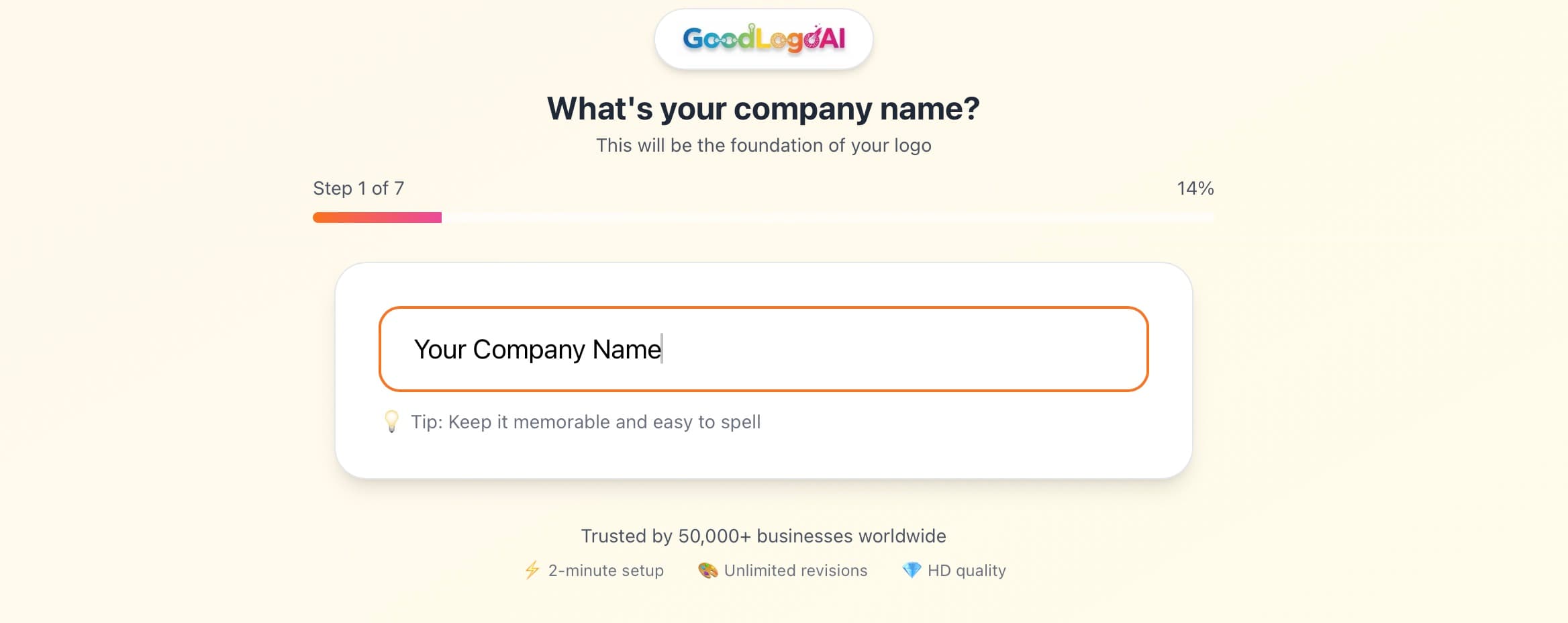
- Name your product category and price point
- Describe your target customer
- Mention the platforms you sell on (Shopify, Etsy, Amazon)
AI Generates Store-Optimized Designs
The AI applies ecommerce-specific design thinking automatically — color psychology matched to your category, shapes that hold up at small sizes, and layouts that print cleanly on packaging.
- Color palette selected for your product category
- Icon tested for legibility at mobile sizes
- Multiple style variations generated for comparison
Refine With Plain-English Edits
Not quite right? Tell the AI what to change — 'more premium, like a black-and-gold luxury brand,' or 'simpler so it works as a tiny icon.' It understands ecommerce design language.
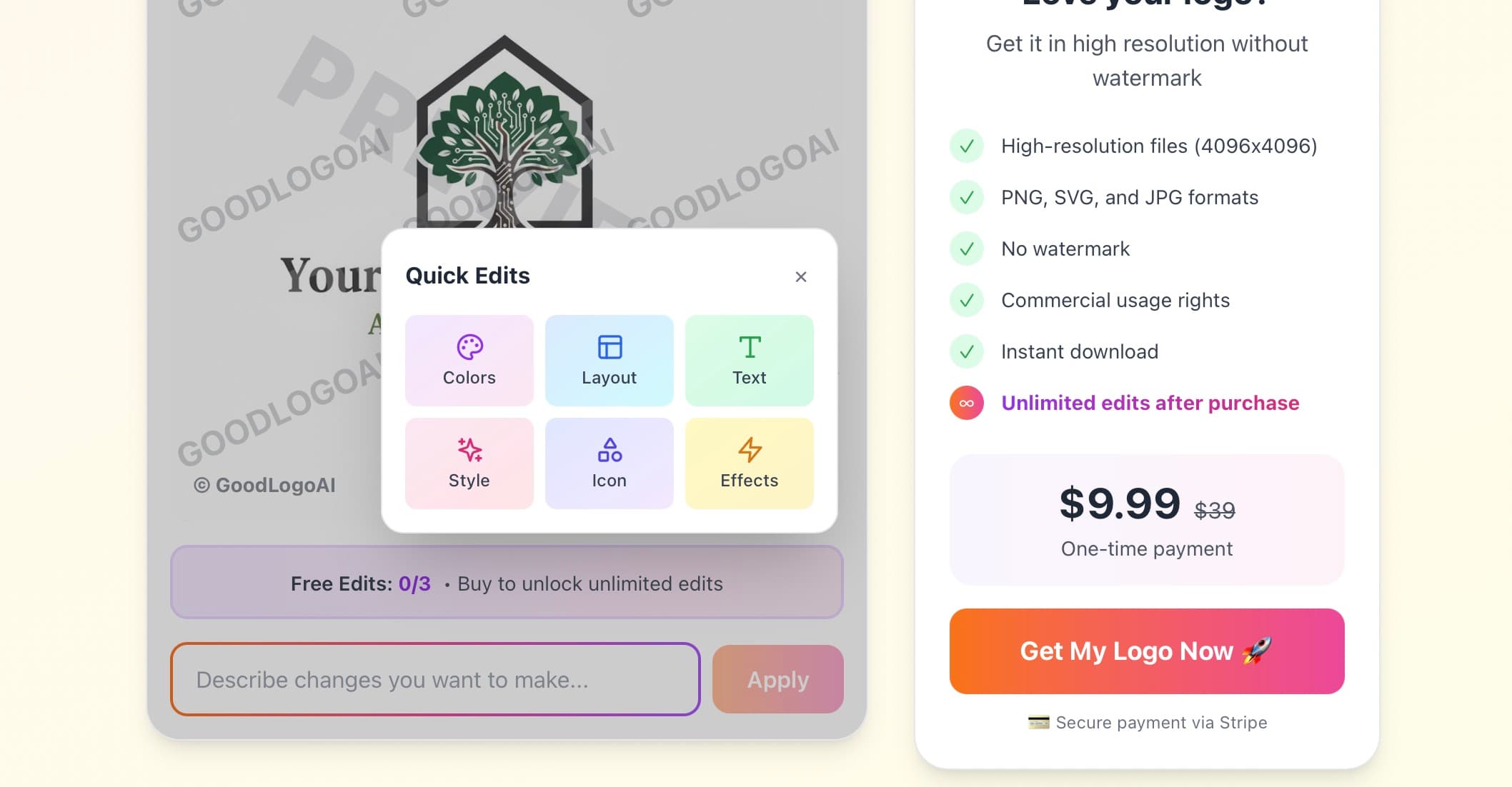
- Try it free 3 times — no card needed
- Reference specific brands for direction
- Test the result at small sizes before finalizing
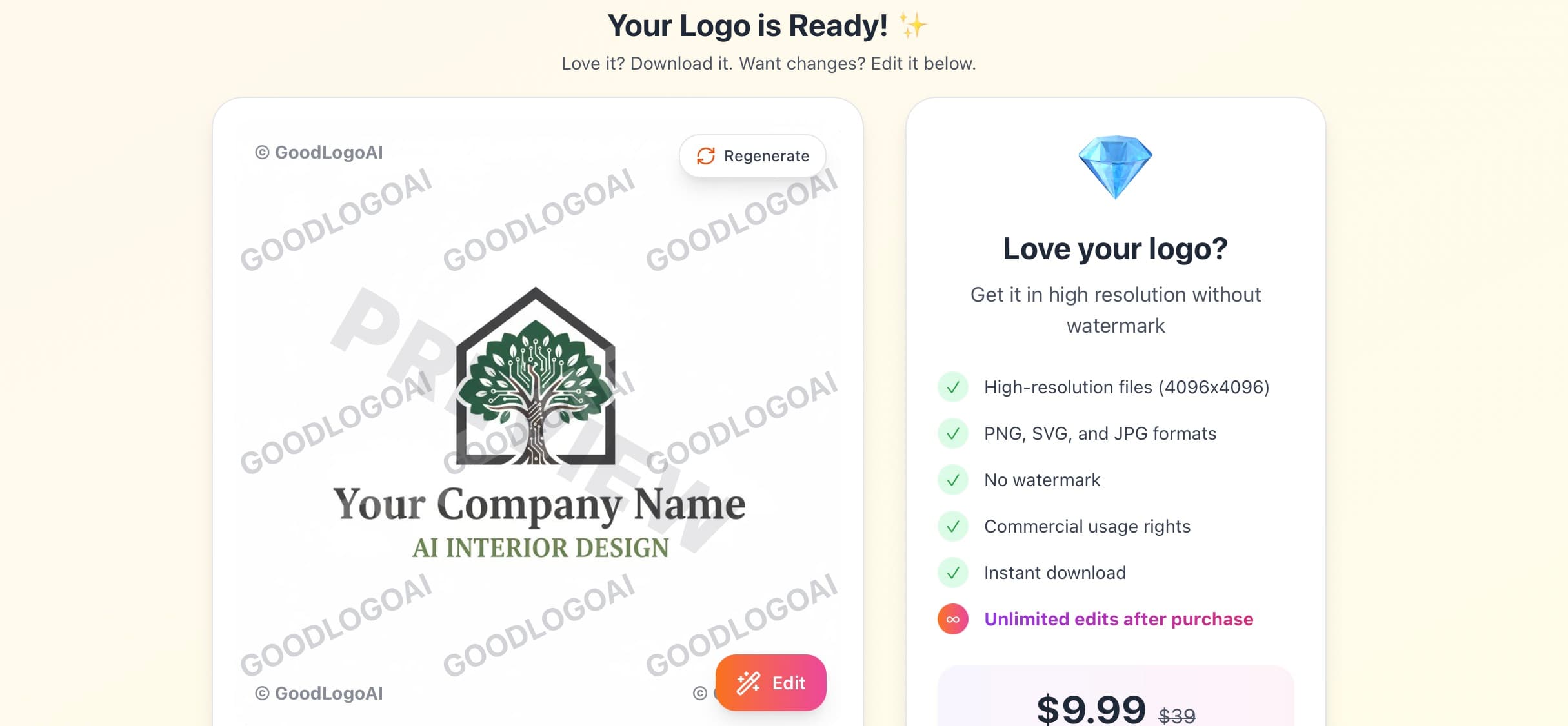
Download & Start Selling
One $9.99 payment gets you SVG for packaging and print, a high-res transparent PNG for your website and app icons, and a JPG for documents — everything you need across every platform.
- SVG for packaging and print vendors
- Transparent PNG for your store and social profiles
- Full commercial rights included
Try free · $9.99 to download · 30-day guarantee
Ecommerce Logo Do's and Don'ts
Do These
✅ Test it on actual packaging
Print your logo on paper and tape it to a box before committing — screen and print often look different.
✅ Make it work as a profile picture
Your Instagram, TikTok, and Facebook profiles crop to a tiny circle. Check it there first.
✅ Match your product category
Beauty, tech, and food logos all carry different visual language — fit your niche while standing out.
✅ Create icon and wordmark versions
You need a standalone icon for social profiles and a full lockup for your website and packaging.
✅ Keep printing costs in mind
A logo that only works in four colors is expensive to print at volume. Design for one or two.
✅ Test for trust
Ask people if they'd buy from a store with this logo. Hesitation is a signal to refine it.
Avoid These
❌ Don't default to a shopping cart icon
Carts, bags, and tags are the most overused symbols in ecommerce branding — they blend in, not stand out.
❌ Don't overload it with detail
Fine detail disappears at small sizes and gets muddy on cheap packaging print runs.
❌ Don't ignore mobile shoppers
Most browsing happens on a phone. If it doesn't work small, it's not working for most of your traffic.
❌ Don't pick colors that clash with your category
Blue can suppress appetite for food brands; pastel pink can undercut a men's product line.
❌ Don't copy a competitor's look
Looking similar feels safe but makes you forgettable — differentiate while staying category-appropriate.
❌ Don't chase this year's design trend
Trendy effects date fast. Classic, restrained design ages far better across years of packaging.
Every Ecommerce Brand Personality, Covered
From minimal DTC brands to bold, colorful marketplaces — our logo maker adapts to your category.
Minimal
Modern
Bold
Luxury
Playful
Eco
Vintage
Tech
2 min
Average creation time
$9.99
One-time payment
SVG
Infinite-scale vector file
4.9 / 5
User rating
Trusted by Online Sellers
"Launched my Shopify store with a logo from GoodLogoAI. Customers tell me it looks professional and trustworthy — exactly what I needed as a new brand."
Maria Santos
Founder, Bella Beauty Shop
"Needed a logo for my Etsy shop that would also work on product photos and packaging. Got exactly what I needed in a few minutes."
David Kim
Owner, Minimalist Home Goods
"As an Amazon seller, my brand needed to stand out in a crowded category. GoodLogoAI made that simple and fast."
Jessica Taylor
Amazon Brand Owner
Ecommerce Logo Design — Frequently Asked Questions
What makes an ecommerce logo different from other logos?
An ecommerce logo has to build trust instantly, since online shoppers can't meet you in person or hold your product before buying. It also needs to stay recognizable at tiny sizes — a mobile checkout screen, an Instagram profile circle, a favicon — and print cleanly on packaging. Most other logo types only face one or two of those constraints; ecommerce logos face all of them at once.
What colors work best for an ecommerce logo?
It depends on what you sell. Black reads premium and works well for luxury goods. Blue signals trust and security, which matters when customers are entering payment details. Red and orange create urgency and suit sales-driven or impulse-buy categories. Green fits organic and eco-friendly products. Match the color to your category and price point rather than picking a favorite.
Should my ecommerce logo include a shopping cart or bag icon?
Generally no. Shopping carts, bags, and price tags are the most overused symbols in ecommerce branding — they signal 'generic online store' rather than your specific business. None of the best-known online brands lean on literal shopping icons. Something that reflects your product or personality will be more memorable.
Do I need different logo versions for my online store?
Yes. In practice you'll use: a square icon for social profile pictures, a horizontal lockup for your website header, a stacked version for packaging and business cards, and a single-color version for cheap, high-volume printing. GoodLogoAI's download includes the formats you need to build these variants.
Will my logo print well on packaging?
Test it before you order packaging: print it at actual size, convert it to solid black and check it still reads clearly, and view it from a few feet away. If any of those fail, the design is too detailed — simplify before committing to a print run.
Can I use the same logo across Shopify, Etsy, and Amazon?
Yes, and you should. Using one consistent logo across every platform you sell on makes your brand easier to recognize and remember. Just adapt the format per platform — square crop for profile photos, horizontal for a website header.
How much should I spend on an ecommerce logo?
Just starting out: $10–100 with an AI logo maker like GoodLogoAI. Once your store is generating consistent revenue: $500–2,000 for a freelance designer who can build a fuller brand system. Established brands with real budget: $5,000–20,000 for an agency. Start affordable and upgrade once the store is proven.
What file formats do I need for an ecommerce logo?
You need a high-resolution PNG with a transparent background for your website and digital use, an SVG for infinite scaling and print, and a JPG for documents. GoodLogoAI includes SVG, PNG, and JPG in every download.
Written by the GoodLogoAI Team • Updated July 2026
Guidance drawn from designing thousands of ecommerce logos across Shopify, Etsy, and Amazon sellers.
Ready to Create Your Ecommerce Logo?
Join online sellers who created a professional logo in minutes — not weeks. Free to try, $9.99 to download all formats.
No signup • SVG + PNG + JPG • 30-day guarantee