A Real Estate Logo That Builds Trust on Sight
Create a professional real estate logo in 2 minutes — readable on a yard sign from the curb, polished enough for a listing presentation, built for agents and brokers who need it fast.
What Is a Real Estate Logo Maker?
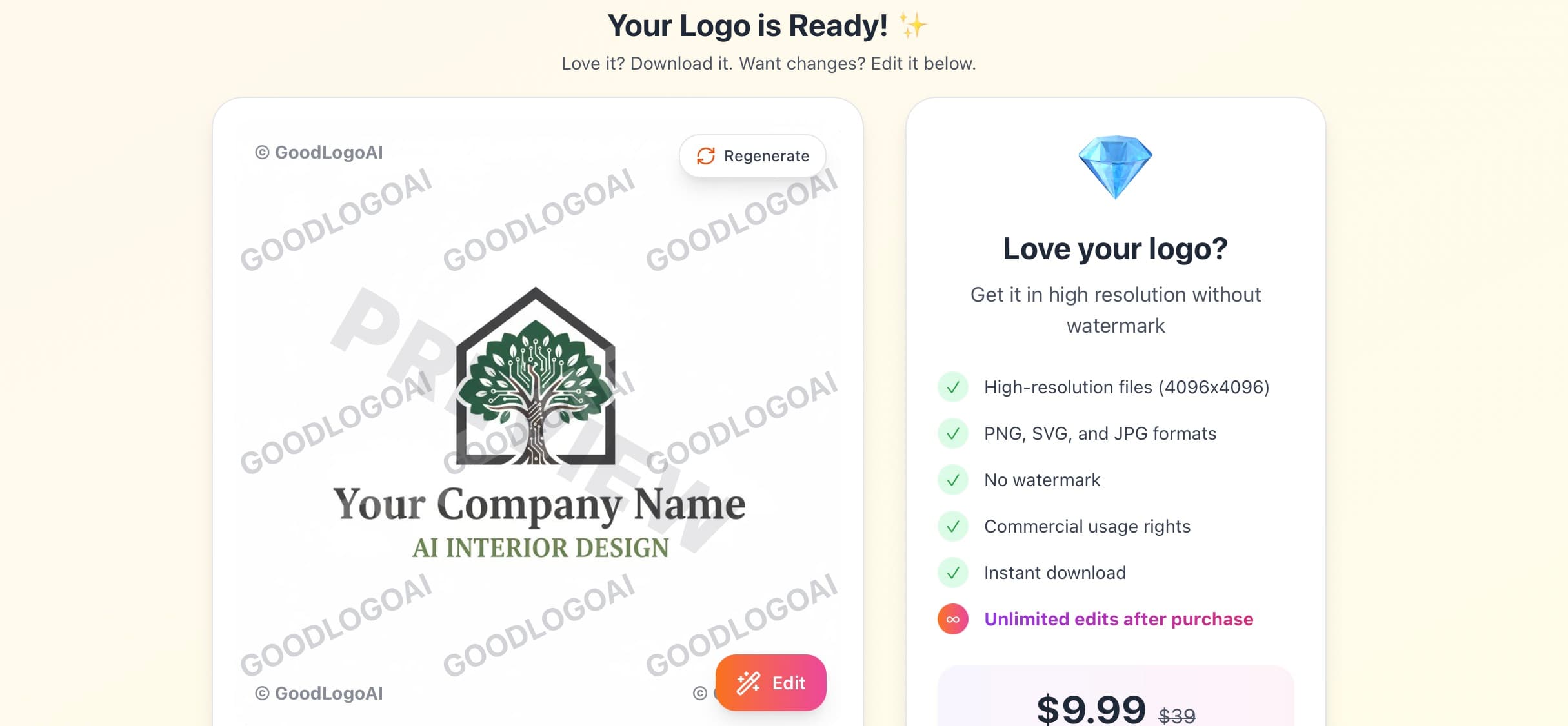
A real estate logo maker is a tool that generates a professional logo for agents, brokers, and property managers without hiring a designer — describe your market and positioning, and it produces an icon and wordmark ready for your yard signs, business cards, and website the same day. GoodLogoAI's version is built around the real constraints of the industry: a logo that has to stay legible from 20 feet away on a yard sign, print cleanly in one or two colors, and still look credible enough for a client trusting you with the biggest purchase of their life.
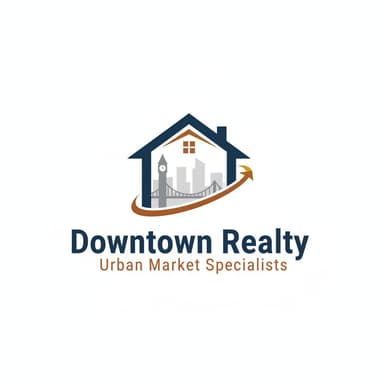
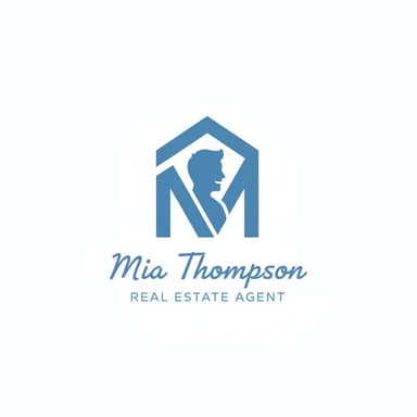
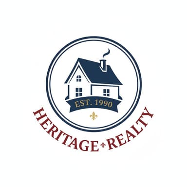
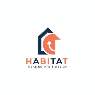
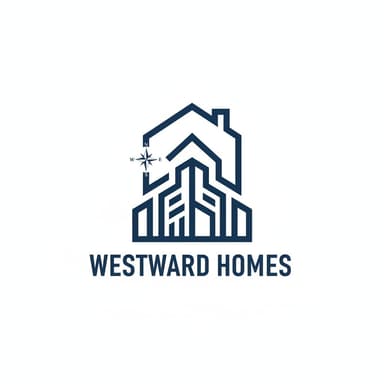
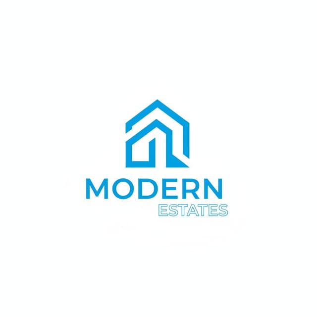
✦ Real estate logos created with GoodLogoAI
Why Real Estate Logos Need Professional Design
In real estate, trust is everything. Your logo shows up on every yard sign, business card, and listing — often the first impression a potential client gets of you.
Instant Credibility
Buyers and sellers are trusting you with their biggest financial decision. A polished logo signals that you're established and serious. An amateur one creates doubt before you've said a word — even if you're the best agent in town.
Local Recognition
Real estate is hyper-local. Your logo needs to become familiar across your territory — on yard signs, mailers, and listings — so you become the name people recognize in their neighborhood.
It Shows Up Everywhere
Yard signs, business cards, websites, social profiles, brochures, email signatures, vehicle wraps — your logo needs to hold up in every one of these contexts, from a tiny profile photo to a four-foot yard sign.
Personal and Professional at Once
Whether you're a solo agent or a growing team, your logo has to feel approachable enough for a first-time buyer and credible enough for a luxury client — a genuine balancing act.
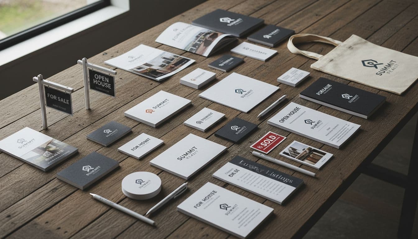
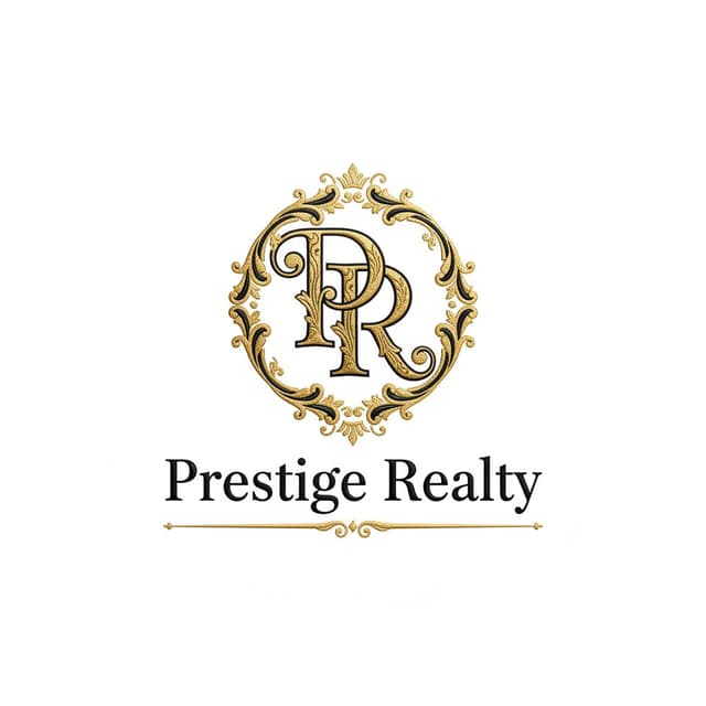
Real Logos Made With Our Real Estate Logo Maker
8 Real Estate Logo Design Principles That Actually Matter
Not generic design rules — the specific patterns shared by agent and brokerage logos that have held up on yard signs and business cards for years.
Trustworthy, Not Playful
Clients are trusting you with the biggest financial transaction most of them will ever make. This isn't the place for quirky or casual design — unless you specifically work vacation rentals. Classic typography and balanced composition read as competent.
Pro tip: When in doubt, lean more professional than casual. Warmth can come from your photography and messaging instead.
Local, Not Generic
Real estate is hyper-local — clients want an agent who knows their neighborhood. A subtle nod to your market (a skyline for urban, a mountain silhouette for the Rockies, a coastline for beach towns) helps you feel like a local expert rather than a franchise template.
Pro tip: Keep it subtle. A small landmark silhouette works better than literally spelling out your territory.

Readable From the Curb
Your logo has to work on a business card and on a yard sign someone glances at while driving 35mph. That's a wider size range than almost any other industry. Bold shapes and high contrast survive that test; fine detail doesn't.
Pro tip: Print it at 2 inches wide. Still legible from 10 feet away? If not, simplify.
Personal Enough to Connect
People hire agents, not brands. If you're building a personal reputation, your logo should reflect that — initials, your name, or something that feels like you rather than a faceless franchise mark.
Pro tip: Think 'KW' for Keller Williams or 'CB' for Coldwell Banker — confident initials can carry a whole brand.
Built to Last a Decade
Yard signs stay up for months, then get reused for years. Rebranding is expensive and confuses clients who've seen your signage around town. Choose something you'll still be proud of in ten years, not something chasing this year's trend.
Pro tip: Look at real estate logos from 2010 that still look sharp today — they're almost always simple and classic.

Color With Intent
Blue builds broad trust. Gold signals luxury. Green suggests growth and fits first-time-buyer positioning. Red creates urgency and energy for high-volume sales. Pick your color because it matches your market, not because it looked nice on screen.
Pro tip: Luxury market? Lean gold, black, or navy. First-time buyers? Lean approachable blues and greens.
Skip the Cliché Symbols
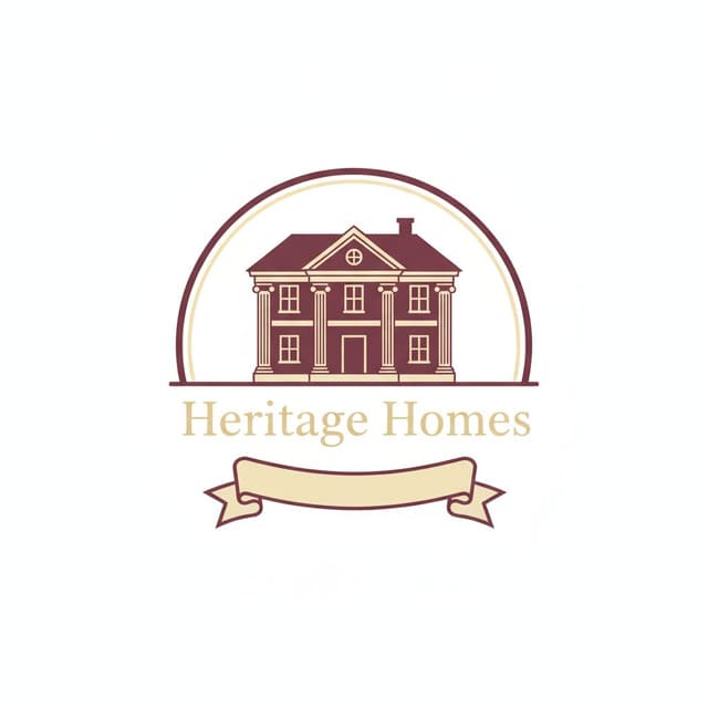
Houses, keys, roofs, and doors show up in the overwhelming majority of real estate logos. If you use a house, make it distinctly yours — or reach for an alternative like a horizon line, a compass, or your initials.
Pro tip: Search "real estate logo" on Google Images. Whatever fills the screen, avoid it.
Print-Ready From Day One
Unlike a purely digital business, real estate leans heavily on print — yard signs, mailers, brochures, business cards. Your logo needs to hold up in full color, black and white, and single-color print runs.
Pro tip: Convert it to solid black. If it still reads clearly, it will print well on a budget yard sign.
Real Estate Logo Color Psychology
Color positions your business before a client reads a single word. Here's what each major choice signals — and which market it fits.
Blue
Trust · Stability · Reliability
Examples: Coldwell Banker, Redfin, Better Homes and Gardens
Best for: General residential real estate, buyer's agents, established brokerages
Gold
Luxury · Premium · Success
Examples: Sotheby's International, luxury boutique agencies
Best for: Luxury listings, high-end markets, exclusive service positioning
Navy
Authority · Sophistication
Examples: Compass, Douglas Elliman, upscale boutique agencies
Best for: Executive relocations, established suburban and upscale markets
Green
Growth · New Beginnings
Examples: First-time-buyer specialists, land and rural agencies
Best for: First-time buyers, land sales, growth-oriented markets
What Makes the Best Real Estate Logos Work
Established brokerage logos all follow the same underlying logic. Here's what you can borrow from each.
Coldwell Banker
National BrokerageClean blue and white with a simple house mark. The color inspires trust, the symbol never overwhelms the name, and it reads clearly at yard-sign size nationwide.
Lesson: A house symbol works fine if it stays simple and pairs with confident typography.
Keller Williams
FranchiseBold red with a distinctive 'KW' lettermark. The color grabs attention on a yard sign; the initials create a brand mark that doesn't rely on a literal symbol at all.
Lesson: Confident initials can carry an entire brand without needing an icon.
Sotheby's International
LuxuryA refined serif wordmark, occasionally paired with gold — no house symbol at all. The name and typography alone signal heritage and exclusivity.
Lesson: In luxury positioning, restraint is the flex. Typography can carry the whole brand.
RE/MAX
FranchiseThe red, white, and blue balloon is instantly recognizable and completely unlike anyone else's house-and-key logo — proof that a real estate logo doesn't need a house at all.
Lesson: Being different is a legitimate strategy. Everyone else chose houses; RE/MAX chose a balloon.
Compass
Modern Tech-ForwardA clean, minimal compass mark in black. Modern and app-friendly, it appeals directly to urban, tech-comfortable buyers rather than a traditional homebuyer audience.
Lesson: A modern market rewards modern design — not every real estate brand needs to look traditional.
Century 21
FranchiseBold black and gold with an angular '21'. The number is memorable, and gold signals premium service without leaning on a house or key at all.
Lesson: A number or a set of initials can become as recognizable as any icon, if used with confidence.
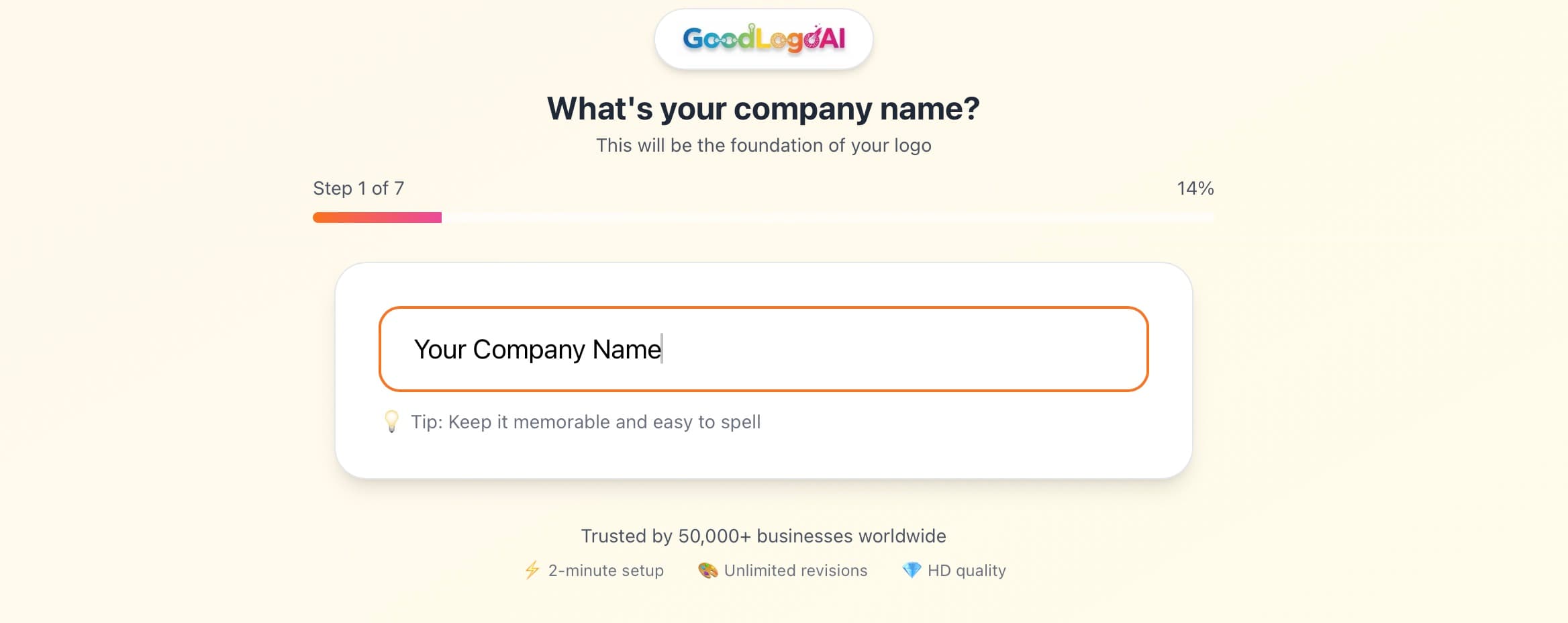
How Our Real Estate Logo Maker Works — 4 Steps
No design skills needed. Describe your market — the AI handles the rest.
Describe Your Real Estate Business
Tell the AI your niche: luxury or first-time buyers, residential or commercial, urban or suburban. Mention your territory and any local elements you'd like reflected.
- Specify your market level (luxury, mid-range, affordable)
- Mention your geographic area or any local landmarks
- State if you're a solo agent, a team, or a brokerage
AI Generates Yard-Sign-Ready Designs
The AI applies real estate-specific design thinking automatically — bold shapes that survive yard-sign scale, colors matched to market positioning, and layouts that print cleanly in one or two colors.
- Color palette selected based on your market position
- Shapes tested for legibility at a distance
- Multiple style variations generated for comparison
Refine With Plain-English Edits
Not quite right? Tell the AI what to change — 'more luxurious, gold instead of blue,' or 'bolder, needs to read from further away.' It understands real estate branding language.
- Try it free 3 times — no card needed
- Ask for both horizontal and stacked versions
- Request a single-color version for cheap printing
Download & Start Marketing
One $9.99 payment gets you SVG for yard signs and vehicle wraps, a high-res transparent PNG for business cards and brochures, and a JPG for basic use — everything you need to launch.
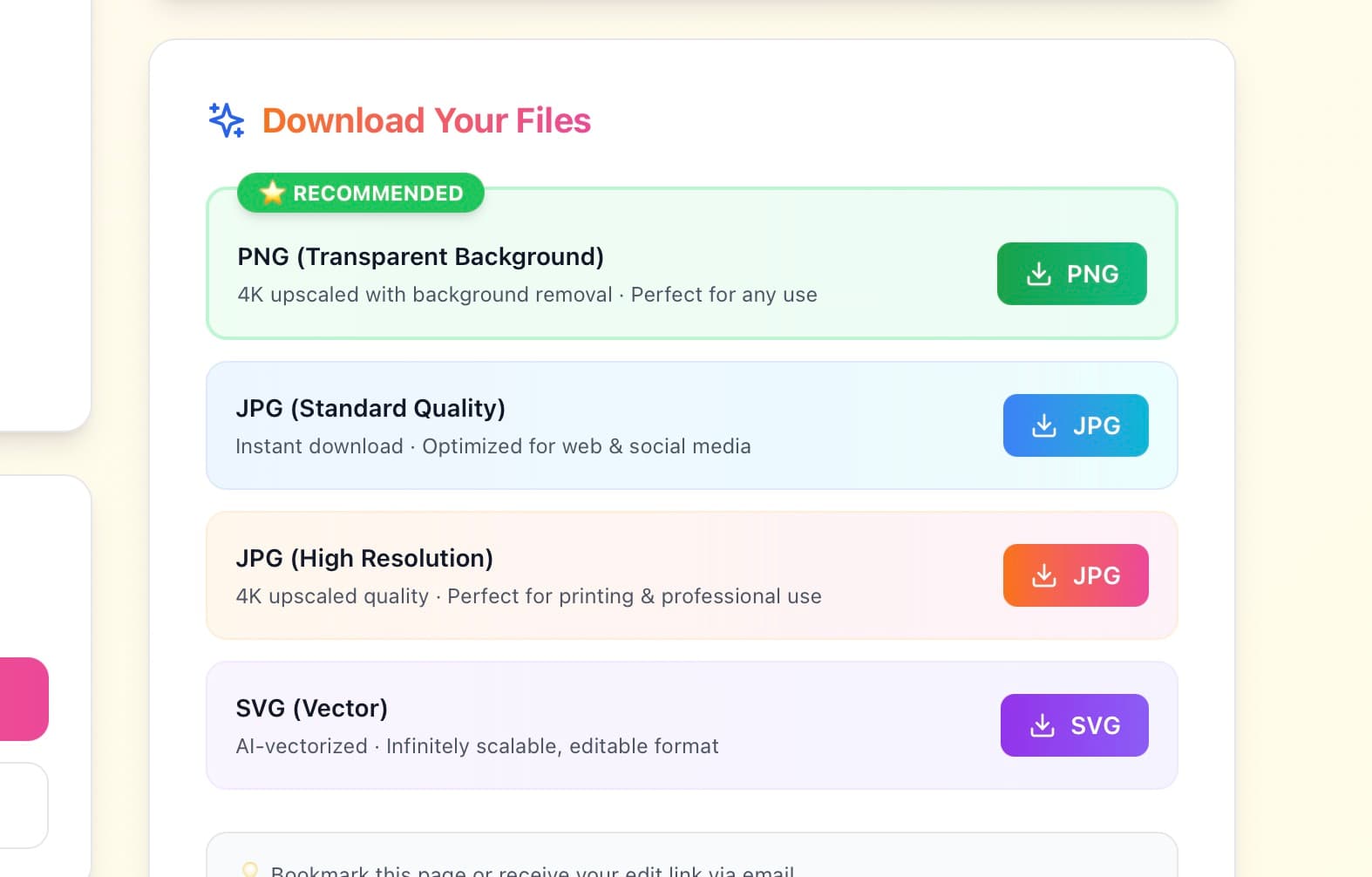
- SVG for sign companies and vinyl wraps
- Transparent PNG for cards and digital use
- Full commercial rights included
Try free · $9.99 to download · 30-day guarantee
Real Estate Logo Do's and Don'ts
Do These
✅ Test on a yard sign mockup
Print it at 8×10 inches and view from 20 feet away. That's how clients see it while driving.
✅ Include your name if building a personal brand
People hire agents, not agencies. Your name should be prominent if you're solo or leading a team.
✅ Create versions for different uses
Full logo for the website, icon for social, horizontal for email, stacked for cards.
✅ Match your market positioning
Luxury calls for sophisticated colors and type. First-time buyers respond to friendly, approachable design.
✅ Keep it print-friendly
Your logo will be printed more than most industries'. Make sure it works in one or two colors.
✅ Think long-term
Yard signs sit for months, then get reused for years. Choose something that won't date quickly.
Avoid These
❌ Don't use generic house clip art
If a thousand other agents use the same house icon, you're not memorable. Make it distinctly yours.
❌ Don't make it too complex
Thin lines and fine detail disappear on a yard sign viewed from 50 feet away.
❌ Don't use too many colors
Every extra color raises printing costs. Most successful agents use just one or two.
❌ Don't use your face as the logo
Your photo belongs on marketing materials, not as the logo itself — logos need to stay abstract and scalable.
❌ Don't copy a competitor exactly
Looking similar feels safe but makes you forgettable. Differentiate thoughtfully.
❌ Don't chase this year's design trend
Yard signs sit around for years. Classic, restrained design ages far better than a trendy effect.
Every Real Estate Brand Personality, Covered
From classic brokerage marks to modern, minimal identities — our logo maker adapts to your market.
Classic
Modern
Luxury
Minimalist
Bold
Elegant
Friendly
Professional
2 min
Average creation time
$9.99
One-time payment
SVG
Infinite-scale vector file
4.9 / 5
User rating
Trusted by Agents & Brokers
"As a new agent, I couldn't justify $2,000 for a designer. GoodLogoAI gave me something professional that looks sharp on my yard signs."
Jennifer Martinez
Realtor, Miami
"Needed a logo that felt premium for luxury listings. Got a gold-and-navy mark in minutes that clients take seriously."
Robert Chen
Broker, Luxury Properties
"Rebranded my whole team's signage after using GoodLogoAI. Consistent look across every yard sign in our territory now."
Amanda Foster
Team Lead, Foster Realty Group
Real Estate Logo Design — Frequently Asked Questions
What makes a real estate logo different from other logos?
Real estate logos need extreme versatility — they have to work on a yard sign visible from 50 feet away while someone drives past at 35mph, as well as on business cards, websites, and vehicle wraps. They also have to build instant trust, since buying or selling a home is the biggest financial decision most people make, and stay print-friendly since yard signs are expensive to reproduce in many colors.
Should I include a house symbol in my real estate logo?
Not necessarily. Houses are the most common symbol in real estate branding, which also makes them the easiest to blend into the background. RE/MAX uses a balloon, Compass uses a modern compass mark, and Sotheby's uses no icon at all — just refined typography. If you do use a house, keep it simple enough to still read clearly at yard-sign distance.
What colors work best for a real estate logo?
It depends on your market position. Blue signals trust and works for broad, general appeal. Gold and black suit luxury markets. Red creates urgency and energy, good for high-volume, sales-driven brands. Green fits first-time buyers and growth-oriented positioning. Navy blends trust with sophistication for upscale markets. Look at your top local competitors, then either match the market norm or deliberately differentiate.
How do I make sure my logo works on a yard sign?
Test it before you print: put it at 8–10 inches wide, tape it to a wall, and view it from 20–30 feet away. If you can't read it in about two seconds, it's too detailed for a yard sign — simplify the shapes and increase the contrast.
Should my logo include my photo?
No. Your photo belongs on business cards, flyers, and marketing materials — not your logo. Photos don't scale down cleanly and print poorly at small sizes. Keep them separate: your logo builds brand recognition, your photo builds personal connection.
How much should I spend on a real estate logo?
New agents just starting out: $10–100 with an AI logo maker like GoodLogoAI. Established agents with steady deal flow: $500–2,000 for a freelance designer. Top producers or brokerages: $5,000–20,000 for a full agency brand system. Start affordable — you can always rebrand once your business is proven.
What file formats do I need for real estate marketing?
Vector files (SVG) for yard signs and vehicle wraps since they scale to any size without quality loss, a high-resolution transparent PNG for business cards and digital use, and a JPG for basic web use. GoodLogoAI includes SVG, PNG, and JPG in every download.
How often should I update my real estate logo?
Rarely. Your yard signs may stay visible in neighborhoods for months at a time, and frequent rebranding confuses clients who recognize your old signage. Plan for your logo to last a decade or more, and only change it if your business model shifts significantly or the original design was genuinely poor from day one.
Written by the GoodLogoAI Team • Updated July 2026
Guidance drawn from designing thousands of real estate logos for agents, brokers, and property managers.
Ready to Create Your Real Estate Logo?
Join agents and brokers who created a professional logo in minutes — not weeks. Free to try, $9.99 to download all formats.
No signup • SVG + PNG + JPG • 30-day guarantee