How to Choose Colors for Your AI Logo 🎨
Master color psychology and theory to create a logo that resonates with your audience and communicates your brand perfectly. A complete guide from color meanings to practical combinations.
Why Color Choice Can Make or Break Your Logo 🎯
Colors aren't just decoration - they're a powerful communication tool that affects how people feel about and remember your brand.
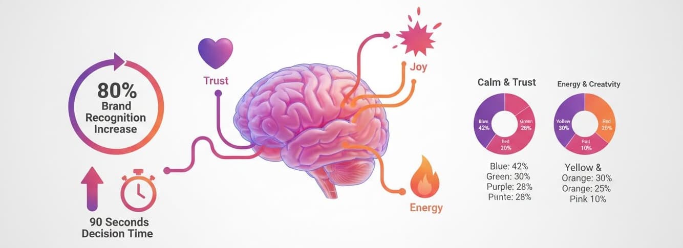
Colors Trigger Emotions
Studies show that color increases brand recognition by up to 80%. People make subconscious judgments about products within 90 seconds, and 62-90% of that assessment is based on color alone.
Industry Expectations
Different industries have color conventions for good reason. Blue dominates finance because it signals trust. Green works for health because it represents nature. Understanding these helps you either fit in or strategically stand out.
Target Audience Response
Different demographics respond to colors differently. Gen Z prefers bold, vibrant colors. Older audiences prefer more subdued tones. Cultural context matters too - red means good luck in China but danger in Western cultures.
Color Psychology: What Each Color Really Means 🎨
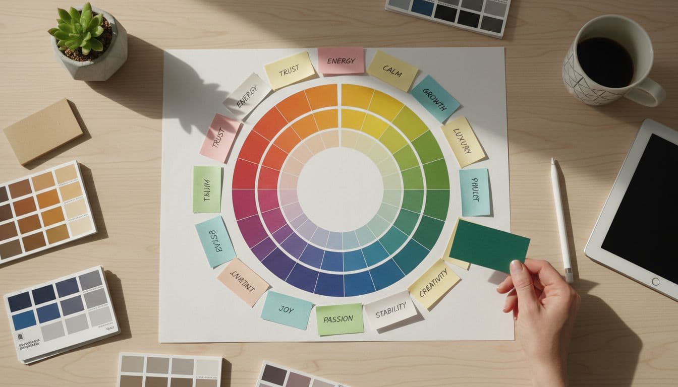
Understanding color psychology helps you choose colors that align with your brand message and resonate with your audience.
Red
#EF4444
Emotions & Associations:
Best For Industries:
Food & Beverage, Entertainment, Sports, Retail
Famous Brands:
Coca-Cola, YouTube, Netflix, Target
✅ When to Use:
Use red when you want to create excitement, urgency, or appetite. Perfect for bold, energetic brands.
❌ When to Avoid:
Healthcare, finance, or any industry requiring calm and trust. Red can feel aggressive.
Blue
#3B82F6
Emotions & Associations:
Best For Industries:
Technology, Finance, Healthcare, Corporate
Famous Brands:
Facebook, IBM, PayPal, LinkedIn
✅ When to Use:
Use blue for professionalism and trust. It's the safest choice for corporate brands.
❌ When to Avoid:
Food industry (blue suppresses appetite) or creative fields where you want to stand out.
Green
#10B981
Emotions & Associations:
Best For Industries:
Eco-friendly, Health, Finance, Organic
Famous Brands:
Whole Foods, Starbucks, Spotify, Android
✅ When to Use:
Use green for eco-friendly, health, or growth-focused brands. Calming and fresh.
❌ When to Avoid:
Luxury brands or tech startups wanting to appear cutting-edge.
Yellow
#F59E0B
Emotions & Associations:
Best For Industries:
Food, Children, Entertainment, Retail
Famous Brands:
McDonald's, IKEA, Snapchat, National Geographic
✅ When to Use:
Use yellow for cheerful, accessible brands. Great for grabbing attention.
❌ When to Avoid:
Luxury or professional services. Too much yellow can feel cheap or overwhelming.
Purple
#8B5CF6
Emotions & Associations:
Best For Industries:
Beauty, Creative, Luxury, Technology
Famous Brands:
Twitch, Hallmark, Yahoo, FedEx
✅ When to Use:
Use purple for creative, luxurious, or imaginative brands. Stands out from competition.
❌ When to Avoid:
Sports or masculine-focused brands. Can feel too feminine in some contexts.
Orange
#F97316
Emotions & Associations:
Best For Industries:
Entertainment, Food, Sports, Tech Startups
Famous Brands:
Nickelodeon, Fanta, Amazon, Harley Davidson
✅ When to Use:
Use orange for fun, approachable brands. Less aggressive than red, more energetic than yellow.
❌ When to Avoid:
Luxury or serious professional services. Can feel childish if not balanced well.
Black
#1F2937
Emotions & Associations:
Best For Industries:
Luxury, Fashion, Automotive, Technology
Famous Brands:
Chanel, Nike, Apple, Mercedes-Benz
✅ When to Use:
Use black for premium, sophisticated brands. Timeless and powerful.
❌ When to Avoid:
Playful or budget-friendly brands. Can feel too serious or unapproachable.
Pink
#EC4899
Emotions & Associations:
Best For Industries:
Beauty, Fashion, Desserts, Creative
Famous Brands:
Barbie, Victoria's Secret, Lyft, Dribbble
✅ When to Use:
Use pink for feminine, fun, or modern brands. Increasingly used in tech for differentiation.
❌ When to Avoid:
Masculine industries or serious B2B services. Can feel too niche.
5 Proven Color Combination Strategies 🎪
Learn how to combine colors harmoniously using color theory principles.
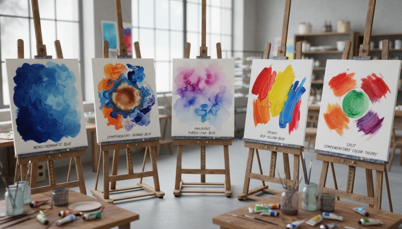
Monochromatic
Different shades of the same color
Pros:
Clean, cohesive, professional
Cons:
Can lack contrast and excitement
Best For:
Minimalist brands, tech companies, professional services
Complementary
Colors opposite on the color wheel
Pros:
High contrast, energetic, attention-grabbing
Cons:
Can be overwhelming if not balanced
Best For:
Sports brands, entertainment, retail
Analogous
Colors next to each other on the wheel
Pros:
Harmonious, pleasing, natural-looking
Cons:
Can lack contrast for readability
Best For:
Creative brands, beauty, lifestyle
Triadic
Three colors evenly spaced on the wheel
Pros:
Vibrant, balanced, dynamic
Cons:
Can be too busy if all used equally
Best For:
Playful brands, entertainment, children's products
Split Complementary
Base color + two adjacent to complement
Pros:
Bold but more balanced than complementary
Cons:
Requires skill to balance properly
Best For:
Modern brands, tech startups, creative agencies
Industry-Specific Color Palettes 💼
Proven color combinations for different industries, based on psychology and successful brands.
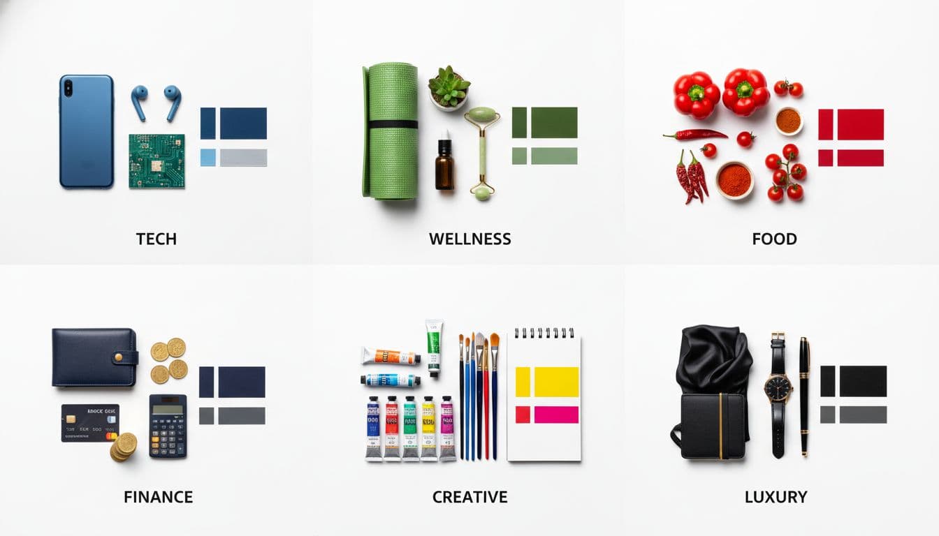
Tech & SaaS
Why This Works:
Blue conveys trust and innovation, purple adds creativity, dark gray for sophistication
Examples:
Stripe, Slack, Notion
Health & Wellness
Why This Works:
Green represents health, blue adds trust, white for cleanliness and simplicity
Examples:
Fitbit, Headspace, Whole Foods
Food & Restaurant
Why This Works:
Red stimulates appetite, yellow adds warmth, black for sophistication
Examples:
McDonald's, Pizza Hut, Wendy's
Finance & Banking
Why This Works:
Blue for trust, dark gray for professionalism, green for growth/wealth
Examples:
Chase, PayPal, American Express
Creative & Design
Why This Works:
Bold, vibrant colors show creativity and artistic flair
Examples:
Dribbble, Behance, Creative Market
Luxury & Premium
Why This Works:
Black for sophistication, gold for luxury, white for elegance
Examples:
Chanel, Rolex, Louis Vuitton
6-Step Process to Choose Your Perfect Colors 📋
Follow this proven process to select colors that truly represent your brand.

Define Your Brand Personality
Before choosing colors, identify 3-5 words that describe your brand
Action Item:
Write down adjectives: Professional? Playful? Bold? Trustworthy? Creative?
Example:
Tech Startup → Innovative, Modern, Trustworthy, Bold
Research Your Industry Standards
Look at competitors and industry norms - then decide to follow or break them
Action Item:
Study 10 competitors' color choices. Note patterns and opportunities to stand out.
Example:
If all competitors use blue, consider purple to differentiate while staying professional
Understand Your Target Audience
Different demographics respond to colors differently
Action Item:
Consider age, gender, culture, and preferences of your ideal customer
Example:
Gen Z → Bold, vibrant colors | Corporate executives → Sophisticated, muted tones
Create a Color Palette
Select 2-3 colors that work together harmoniously
Action Item:
Use color wheel theory: complementary, analogous, or triadic combinations
Example:
Primary: #3B82F6 (Blue), Accent: #F97316 (Orange), Neutral: #1F2937 (Dark Gray)
Test Across Mediums
Ensure colors work on screens, print, merchandise, and backgrounds
Action Item:
Test on white, black, and colored backgrounds. Check digital and print versions.
Example:
Logo should be visible on: Website, business cards, t-shirts, social media
Get Feedback
Test your color choices with real people from your target audience
Action Item:
Show 3-5 color variations and ask which feels most aligned with your brand
Example:
Survey: 'Which color combination feels most trustworthy for a finance app?'
5 Color Mistakes That Kill Logos (And How to Avoid Them) ⚠️
Don't make these common color selection mistakes that can sabotage your brand.
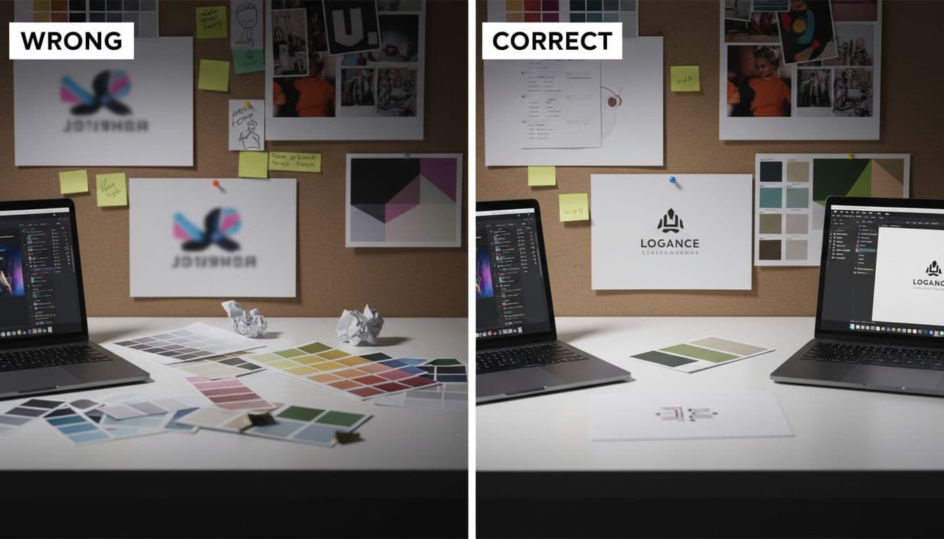
❌ Mistake #1: Using Too Many Colors
Why It's Bad:
Dilutes brand identity and looks unprofessional
The Fix:
Stick to 2-3 colors maximum. One primary, one accent, one neutral.
Quick Check:
❌ 5+ colors = confusing | ✅ 2-3 colors = cohesive
❌ Mistake #2: Ignoring Color Accessibility
Why It's Bad:
Low contrast makes logos hard to read for many people
The Fix:
Ensure 4.5:1 contrast ratio minimum between text and background
Quick Check:
❌ Light gray on white | ✅ Dark text on light background
❌ Mistake #3: Following Trends Blindly
Why It's Bad:
Trendy colors date quickly and may not fit your brand
The Fix:
Choose colors that align with your brand values, not trends
Quick Check:
❌ Using millennial pink because it's trendy | ✅ Using pink because it fits your brand
❌ Mistake #4: Not Testing in Black & White
Why It's Bad:
Your logo needs to work without color (faxes, stamps, etc)
The Fix:
Design works in black/white first, then add color
Quick Check:
❌ Logo only works in color | ✅ Logo recognizable in black & white
❌ Mistake #5: Choosing Colors Based on Personal Preference
Why It's Bad:
Your favorite color might not resonate with your target audience
The Fix:
Choose colors based on psychology and target audience research
Quick Check:
❌ 'I like blue' | ✅ 'My tech-savvy audience responds to blue'
Essential Color Tools for Logo Design 🛠️
Professional tools to help you choose and test your color palette.
Adobe Color
Professional color wheel and palette generator
Best For:
Creating harmonious color schemes based on color theory
Coolors.co
Fast palette generator with trending colors
Best For:
Quick inspiration and palette exploration
WebAIM Contrast Checker
Accessibility contrast ratio testing
Best For:
Ensuring your colors meet accessibility standards
Paletton
Advanced color scheme designer
Best For:
Testing different color harmonies with live preview
Quick Color Selection Tips 💡
Start with One Color
Choose your primary color first based on your brand personality, then build your palette around it.
Think Mobile First
Most people will see your logo on screens. Test colors on different devices and brightness levels.
Consider Cultural Context
If you're targeting global markets, research color meanings in different cultures.
Less is More
The best logos use 2-3 colors maximum. Nike uses just black and white!
Test in Context
See your logo on business cards, website mockups, and merchandise before finalizing.
Trust Your Gut
After research and testing, go with colors that feel right for your brand's personality.
Ready to Choose Your Perfect Logo Colors? 🎨
Use our AI powered logo maker to experiment with different color combinations instantly. See your logo in various colors and find the perfect palette!
⚡ Try different color combinations • 3 free edits • Perfect your palette with AI